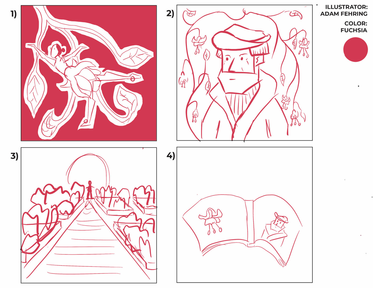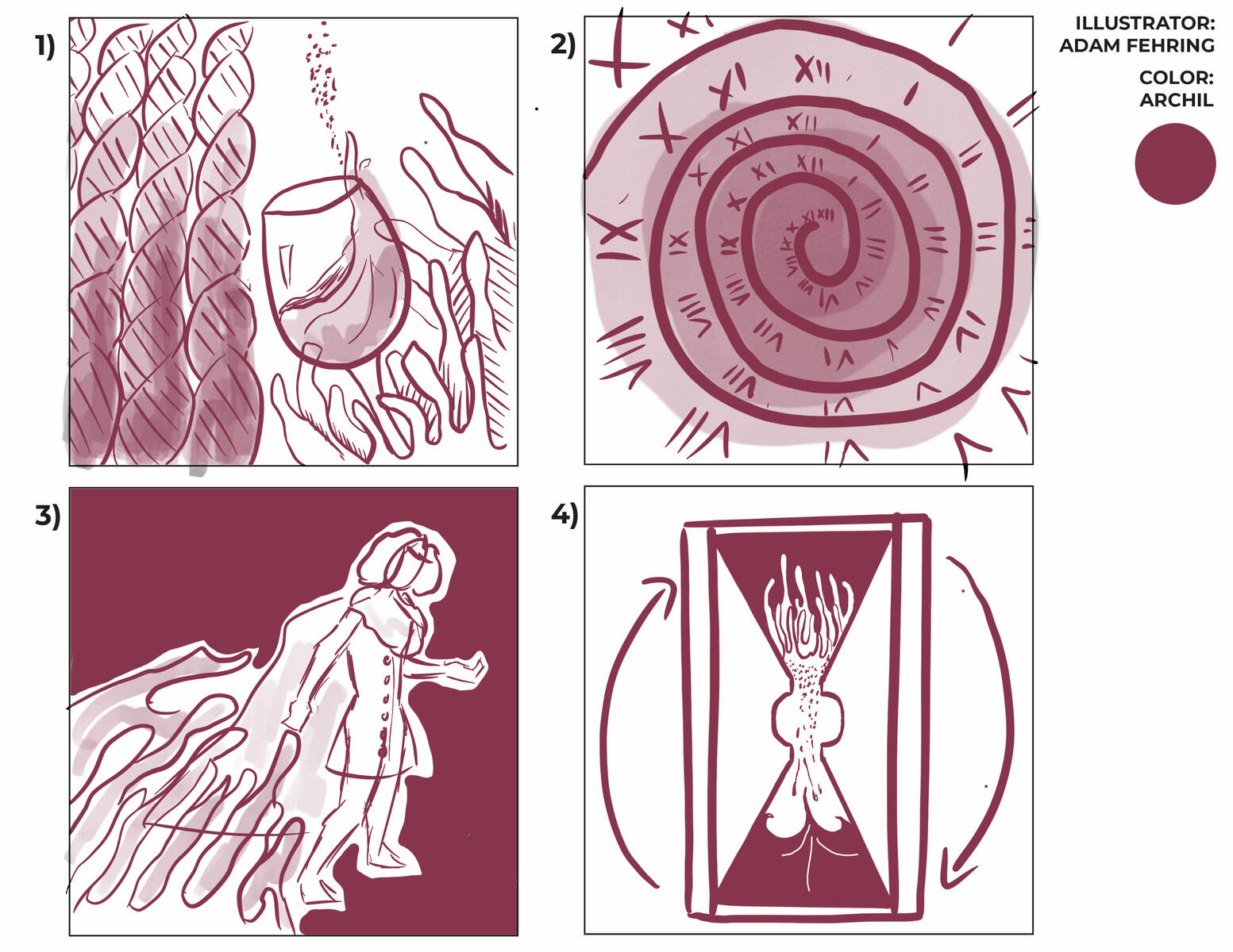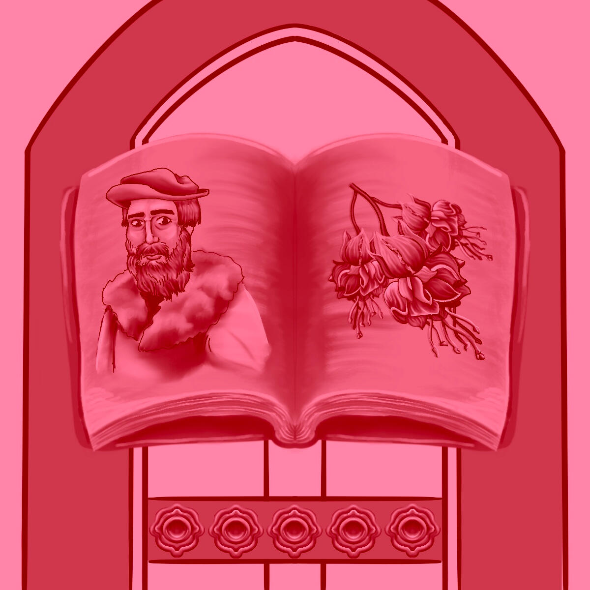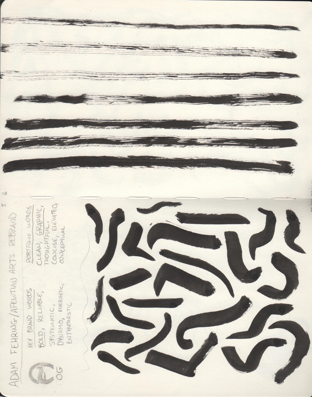


Adam Fehring, aka Afewtian, is a Milwaukee-based illustrator and graphic designer specializing in conceptual and vector-based illustrations. Fehring captures the attention of his target demographics through thorough research and trend analysis showcased within bold graphics, hand-rendered type, and saturated color schemes.Professionally, he has worked as a designer for higher education institutions such as the University of Wisconsin-Milwaukee, Milwaukee Institute of Art & Design, and Carroll University. As an illustrator, he has done work for Trek, Penfield Children’s Center, and Kohl’s.When not working in the industry, Fehring occupies his time doing a variety of volunteer work and getting involved in his local community.
See some of Adam's work that you like? Let him know what you think!
Have an idea for a logo, illustration, or painting that you'd like to see brought to life? Commission Adam to do the work!Wonder what Adam is up to? Follow him on social media to find out!


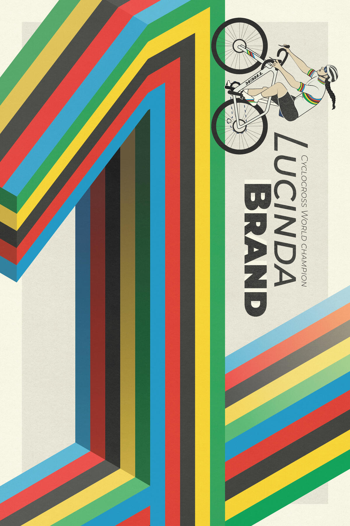
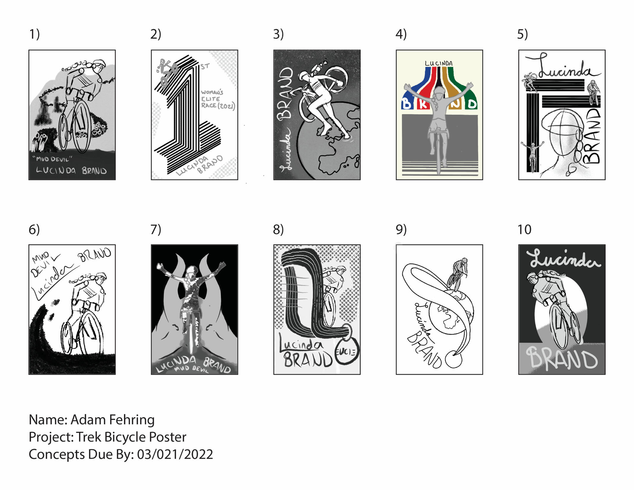
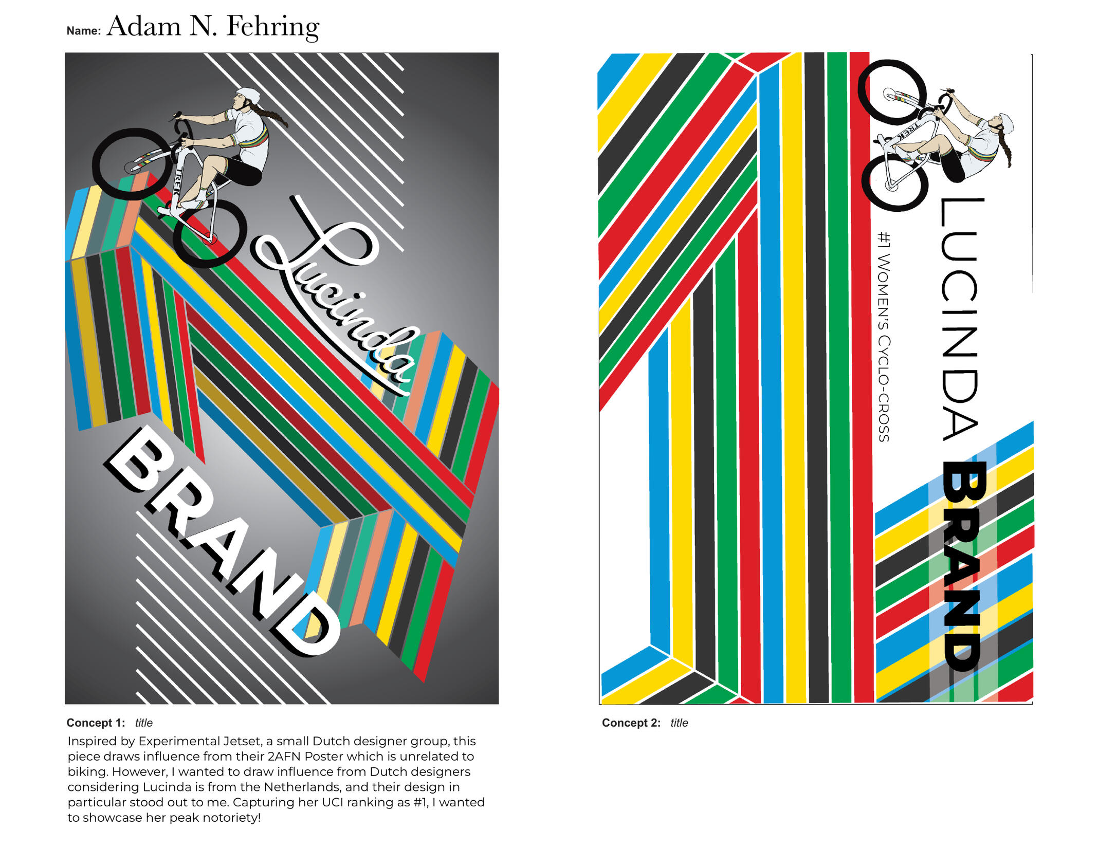
TREK • Modern Icons: Celebration of Women Cycling • Lucinda Brand (Click for Process Work)

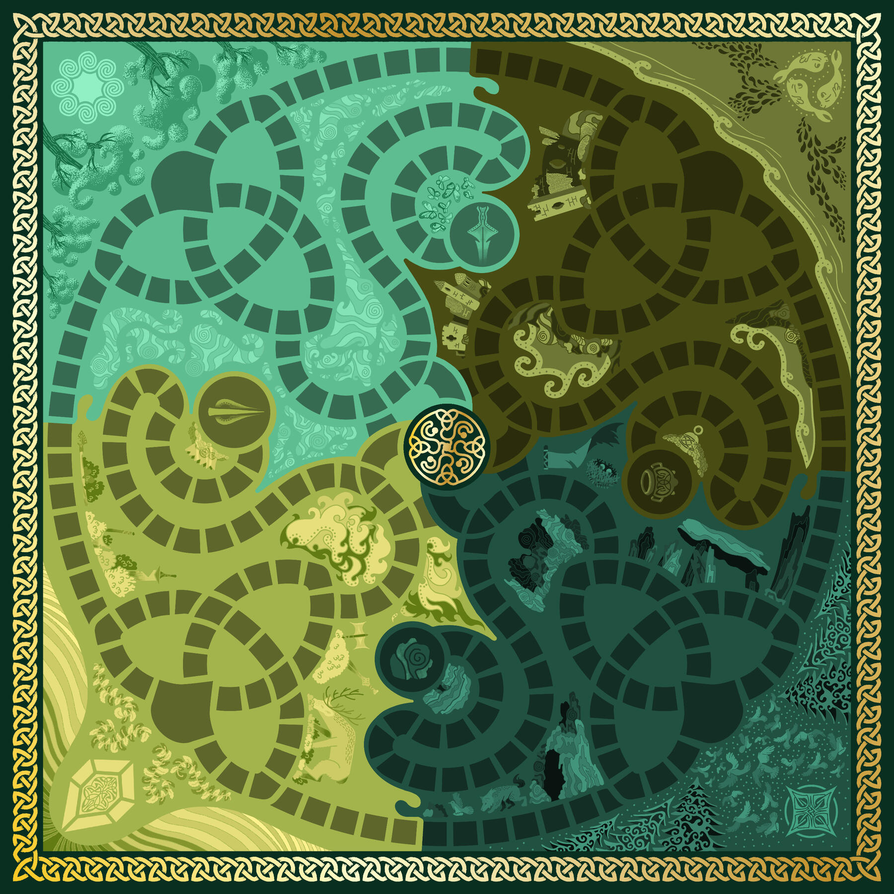
Fairy Fort (Board Game)

Penfield Children's Center: Croquet Ball

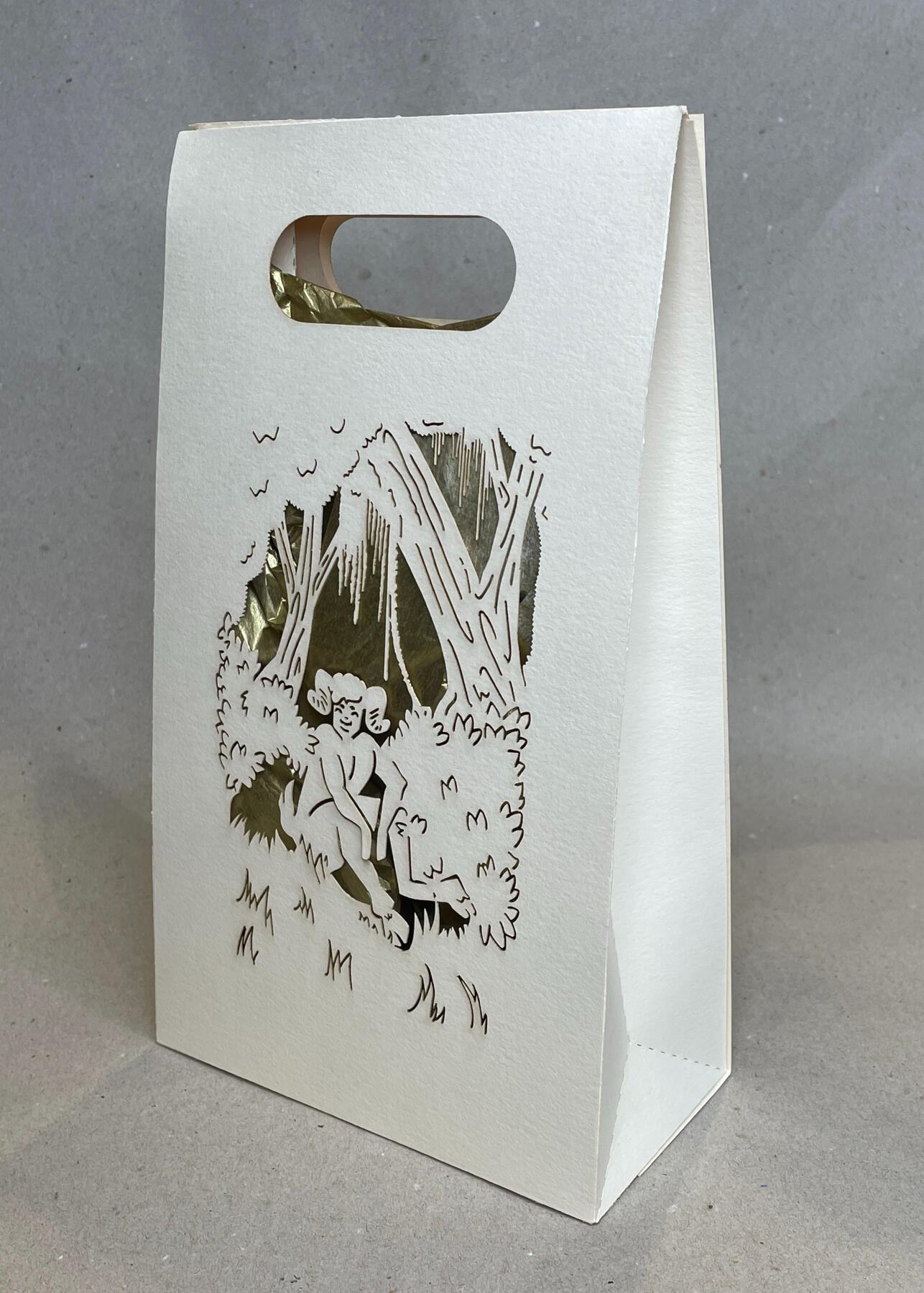
Gift Bag

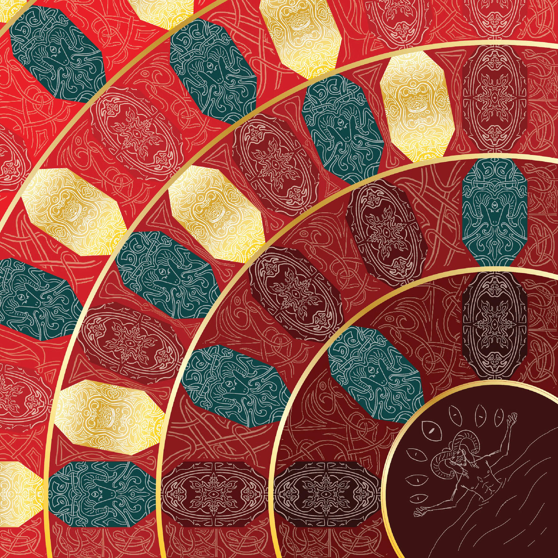
Inferno: Board Game (Close-up)

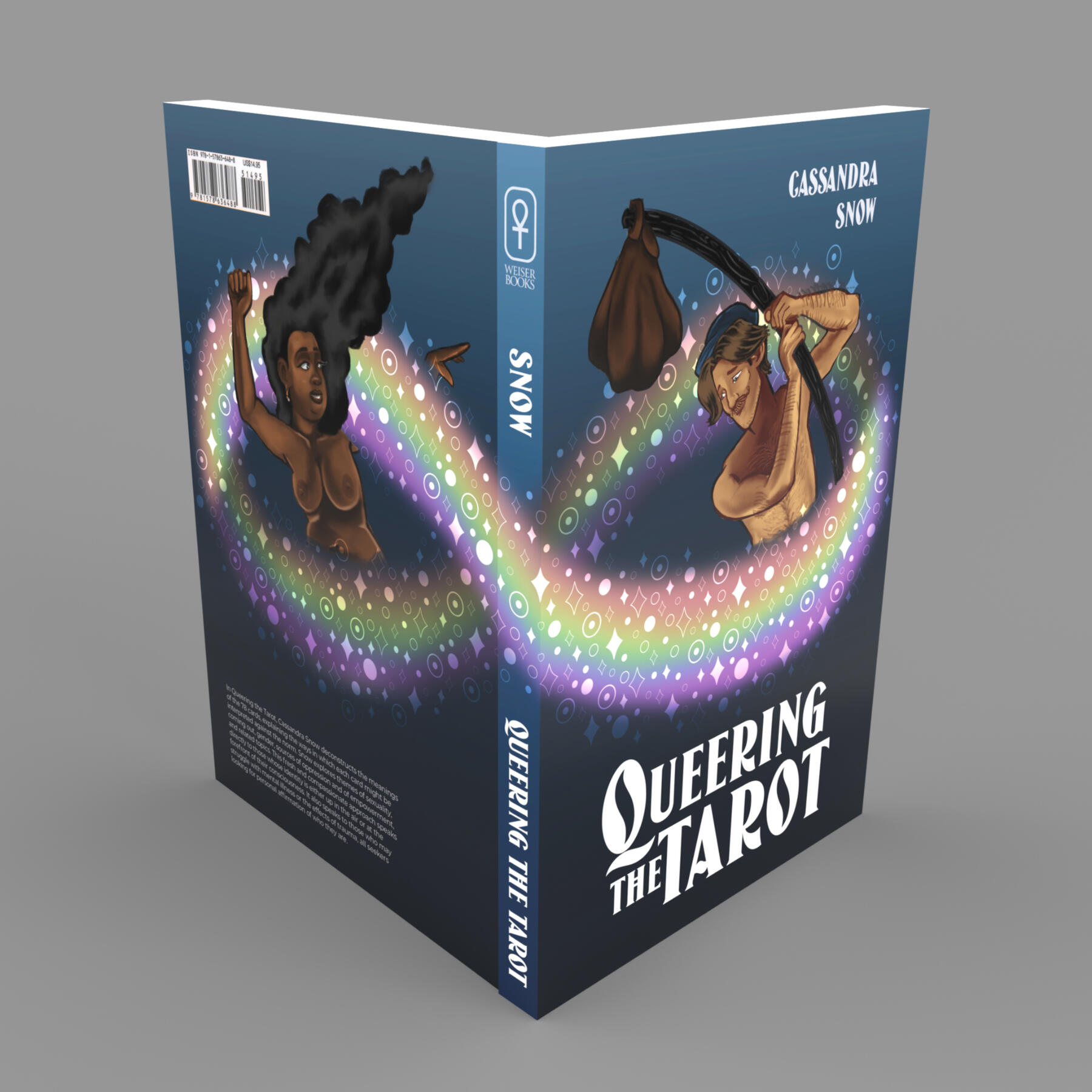
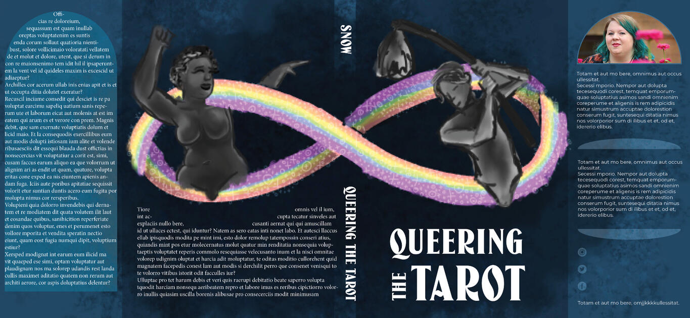
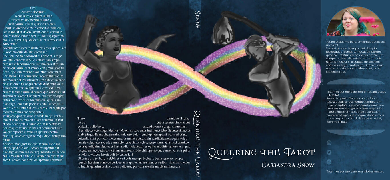
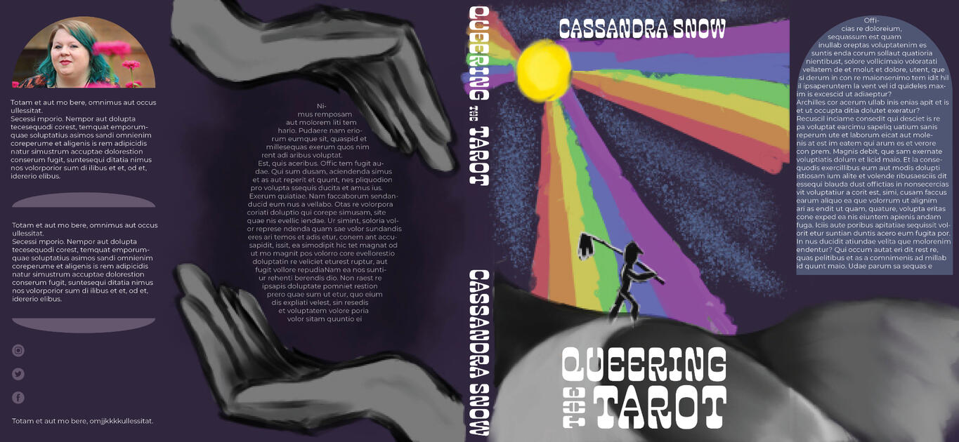
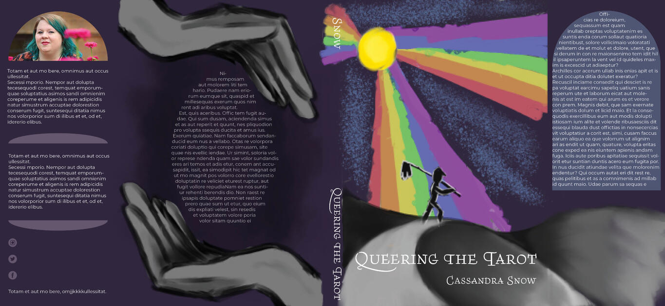
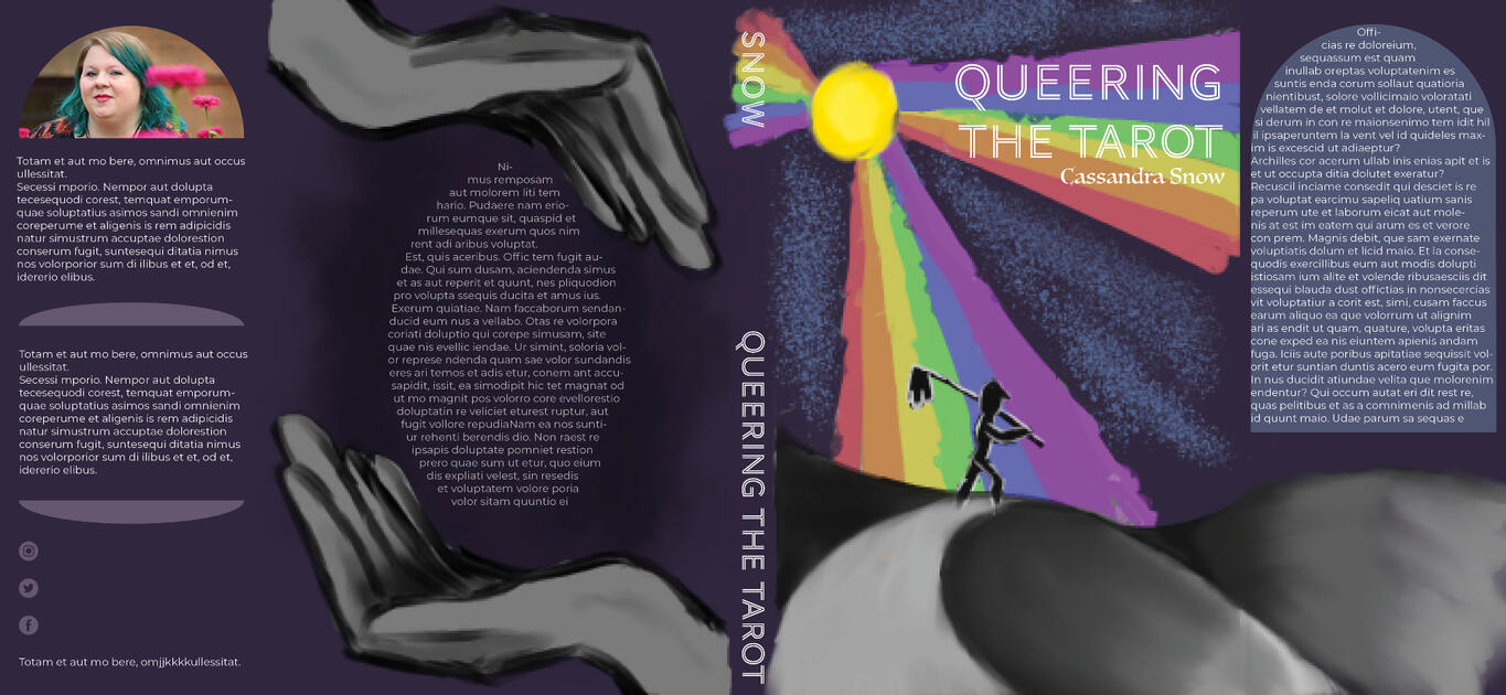
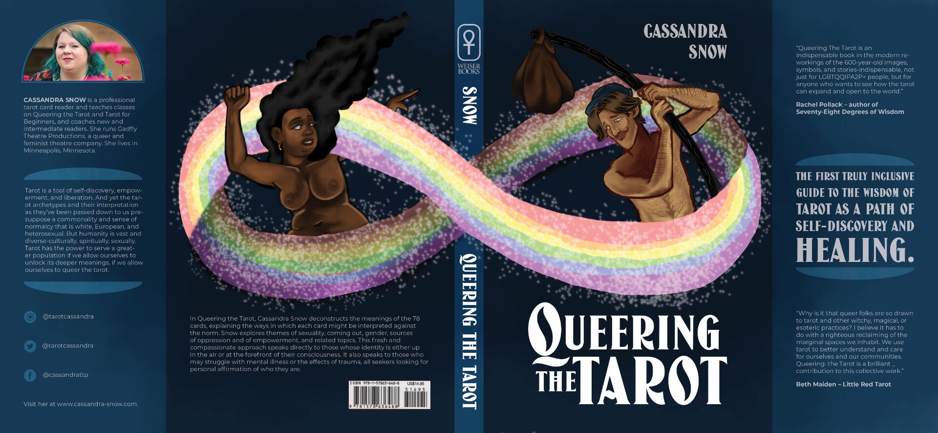
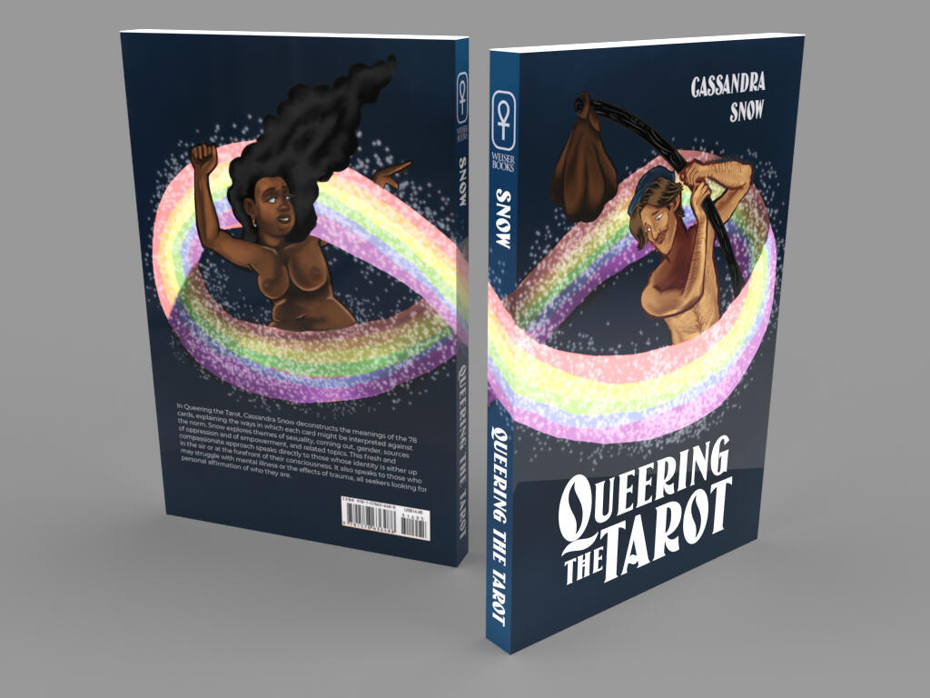
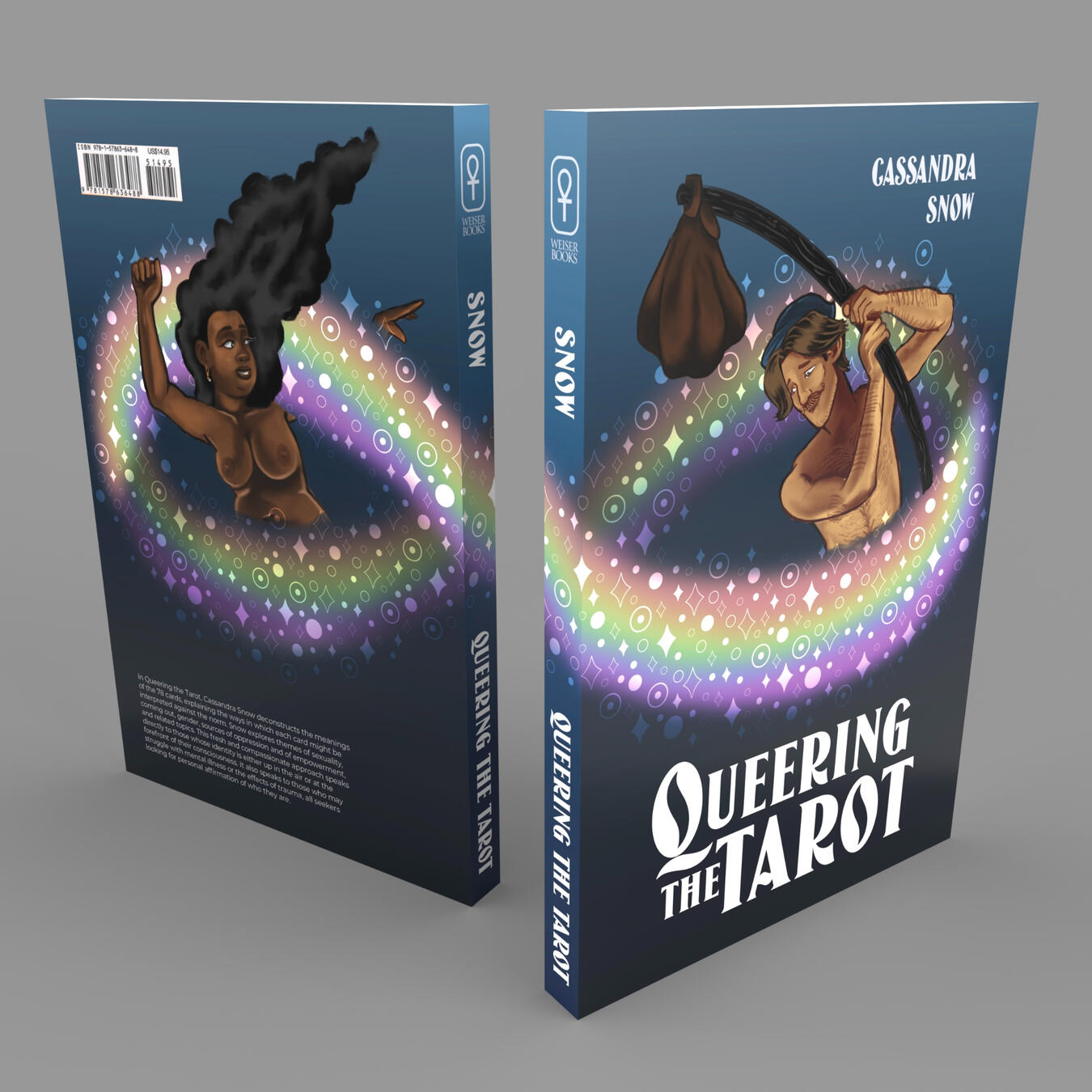
Queering the Tarot (Click for Process Work)

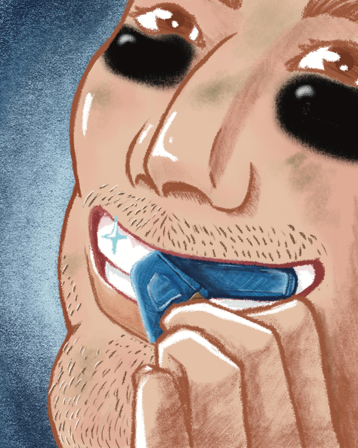
Levi's Make Teeth Whiter for Football Players

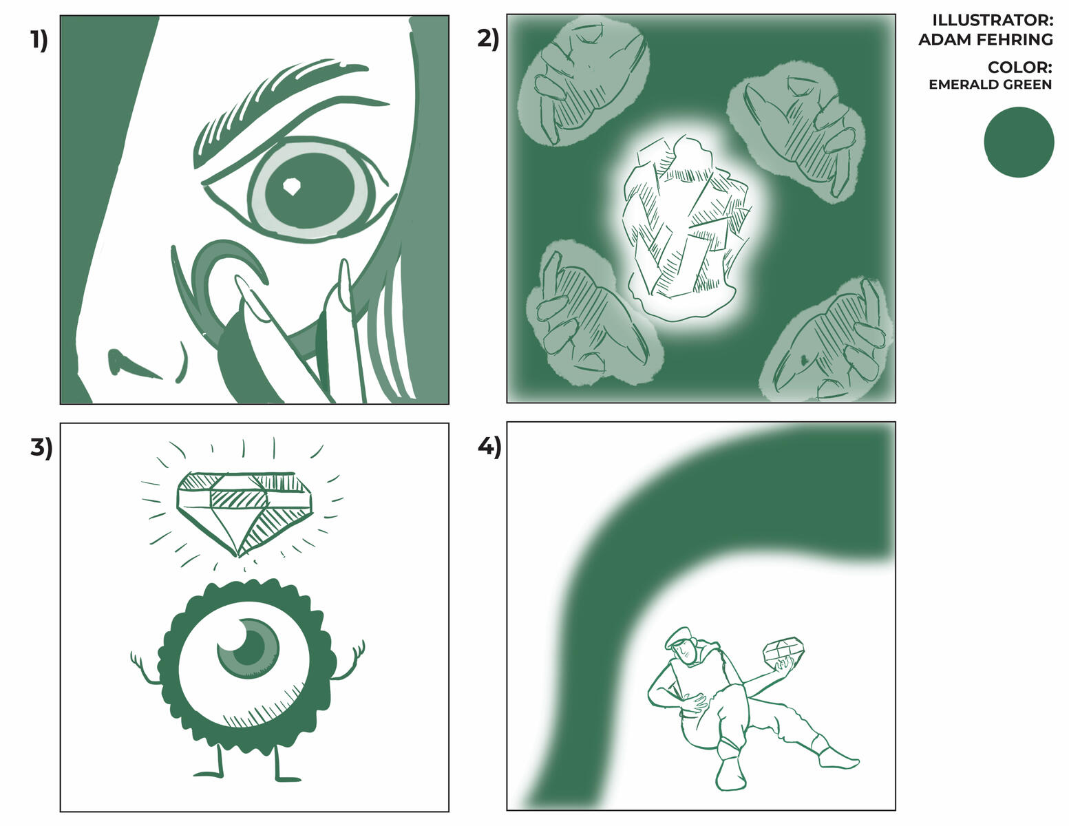
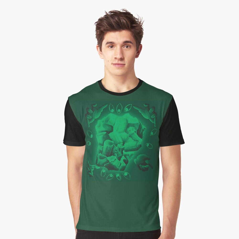
Secret Lives of Color: Emerald (Click for Process Work)
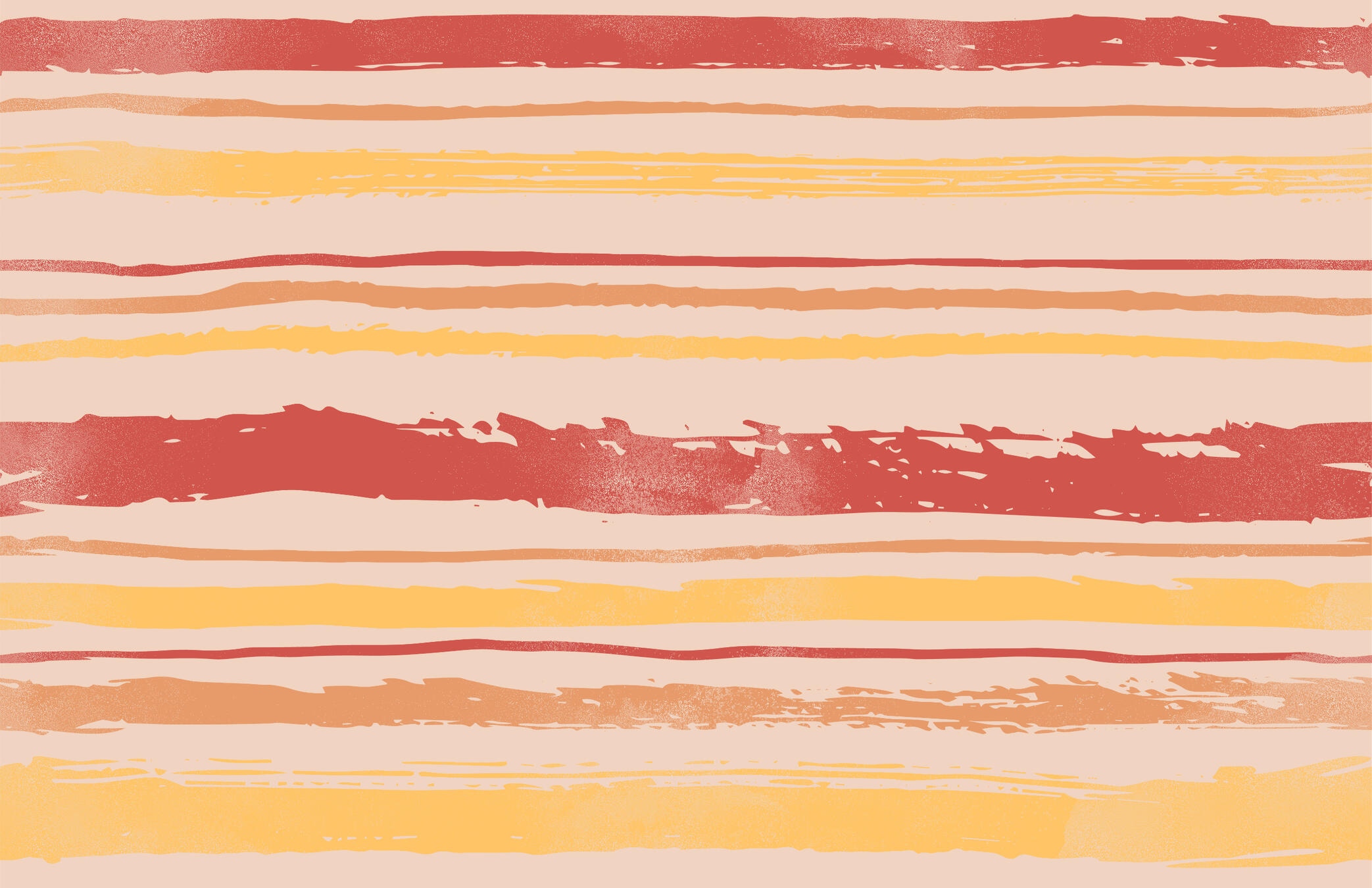
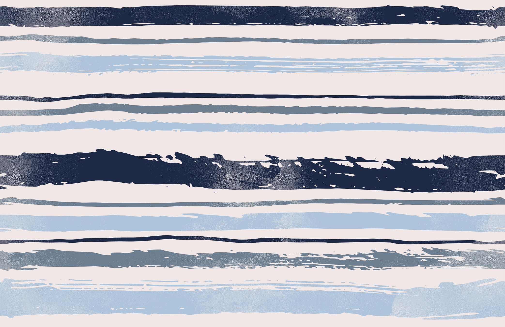
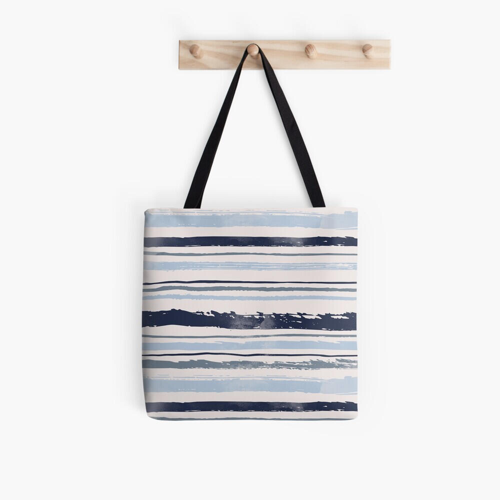
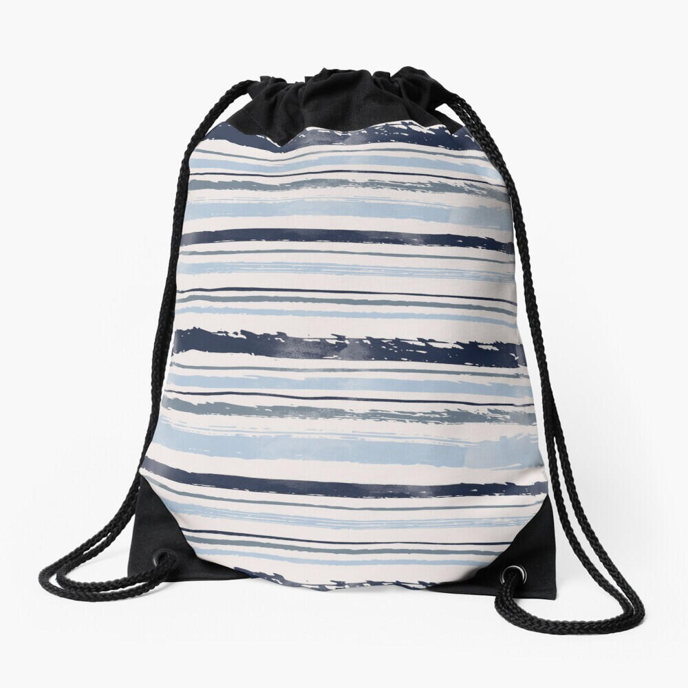
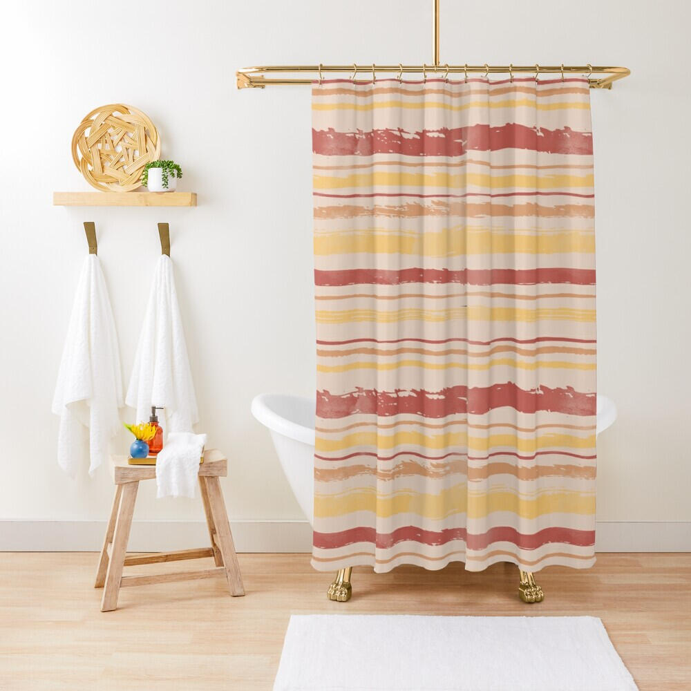
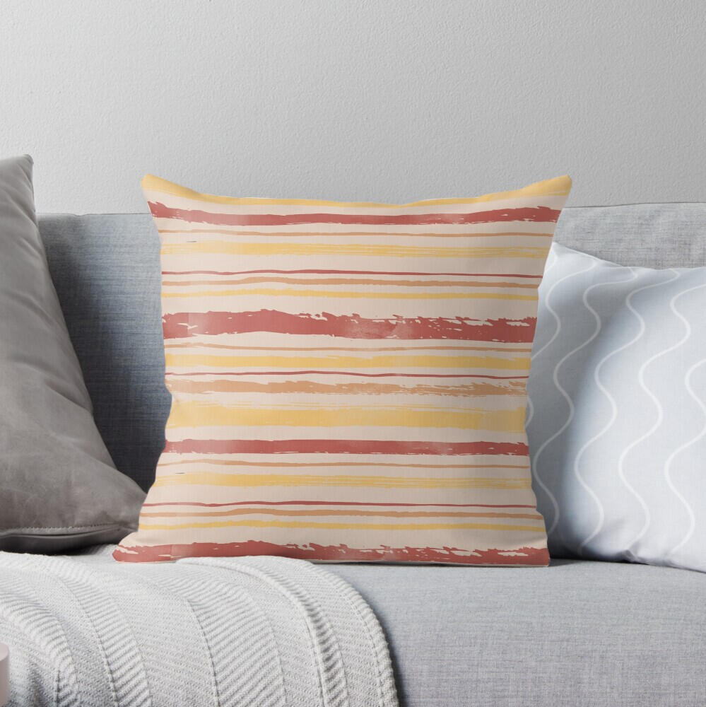
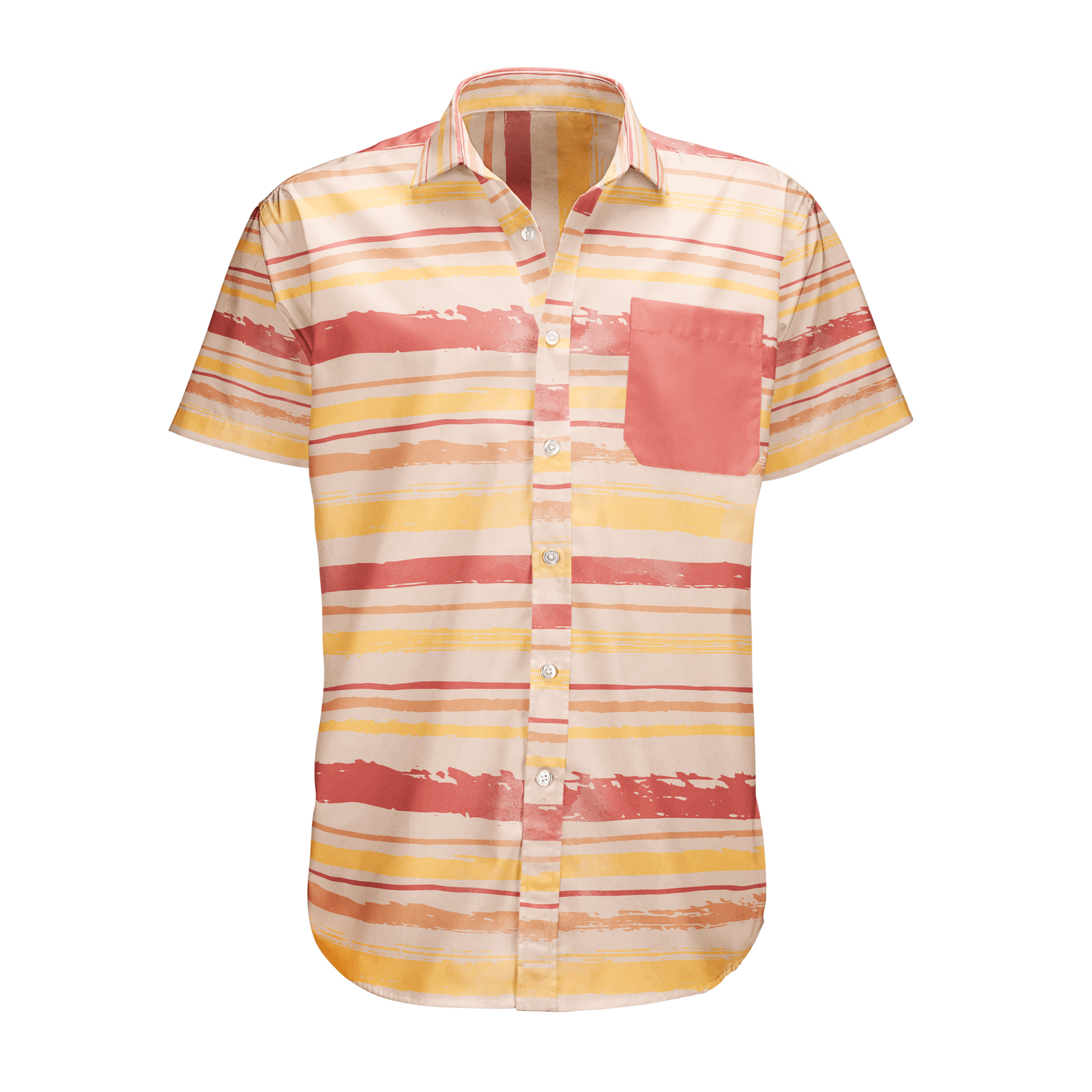
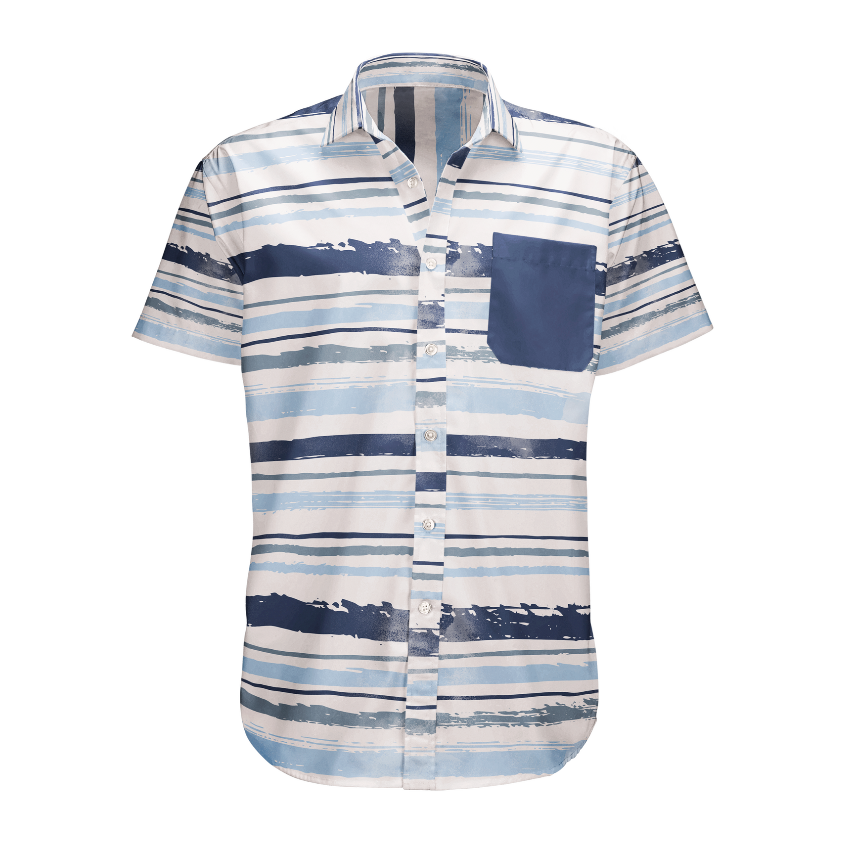
Surface Design

The Process of Designing a Book Cover
Brief
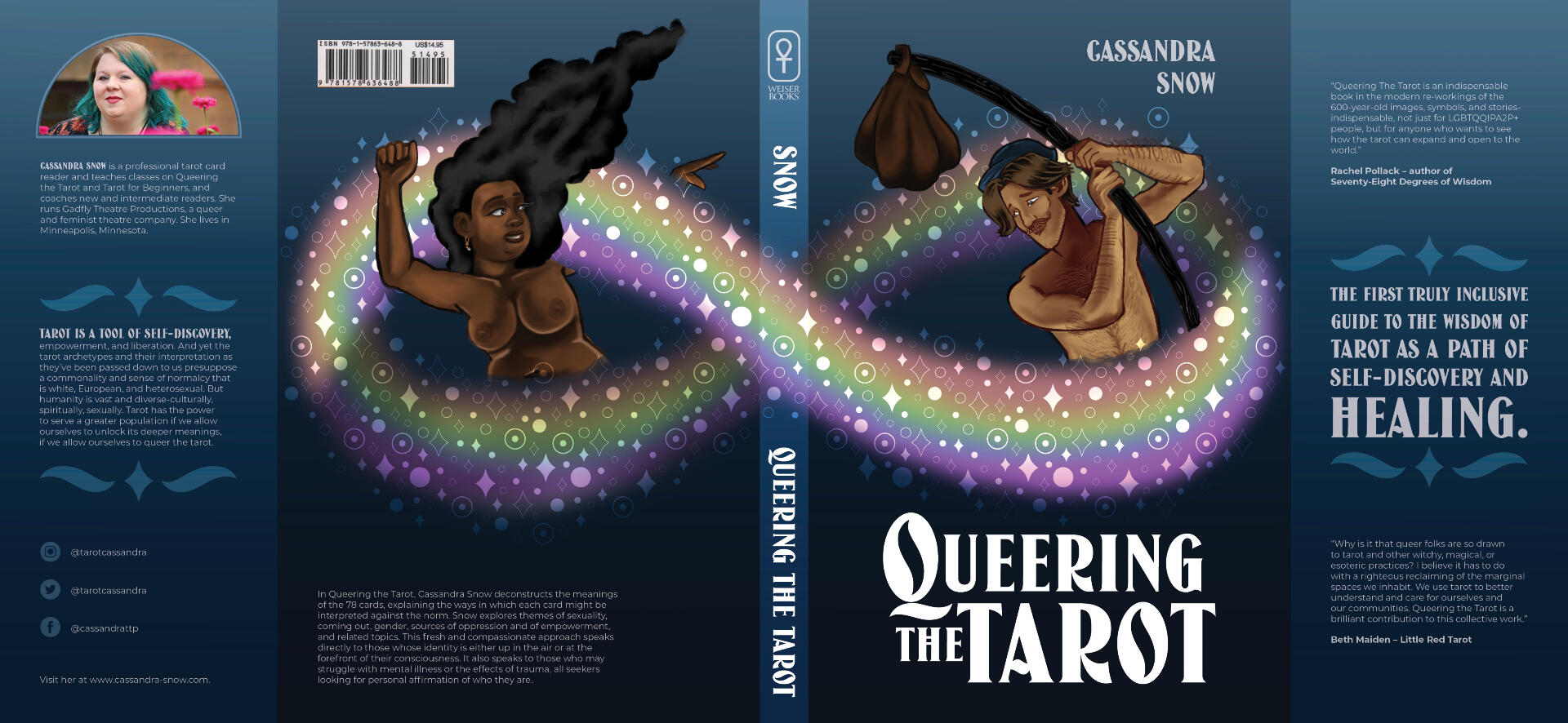
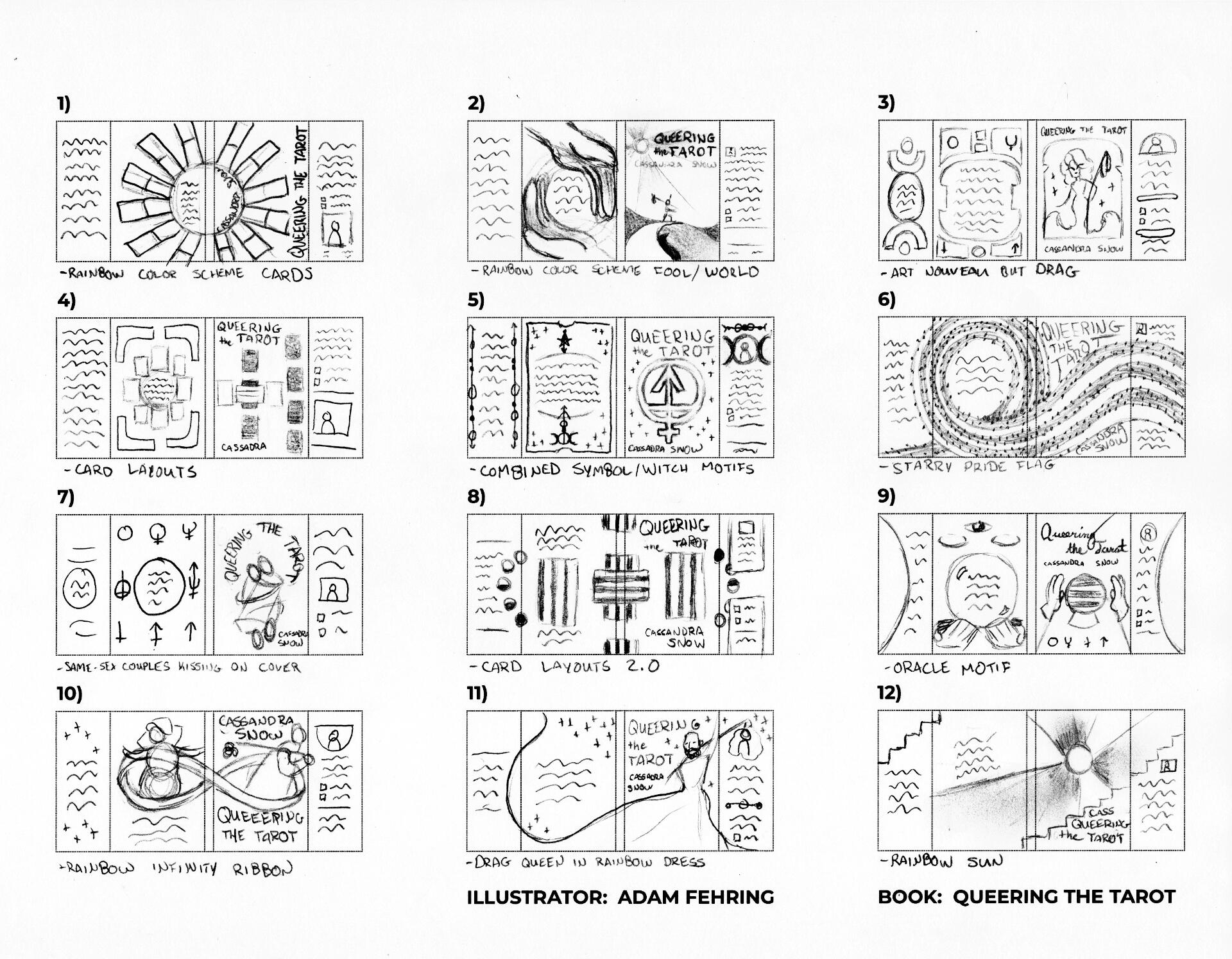
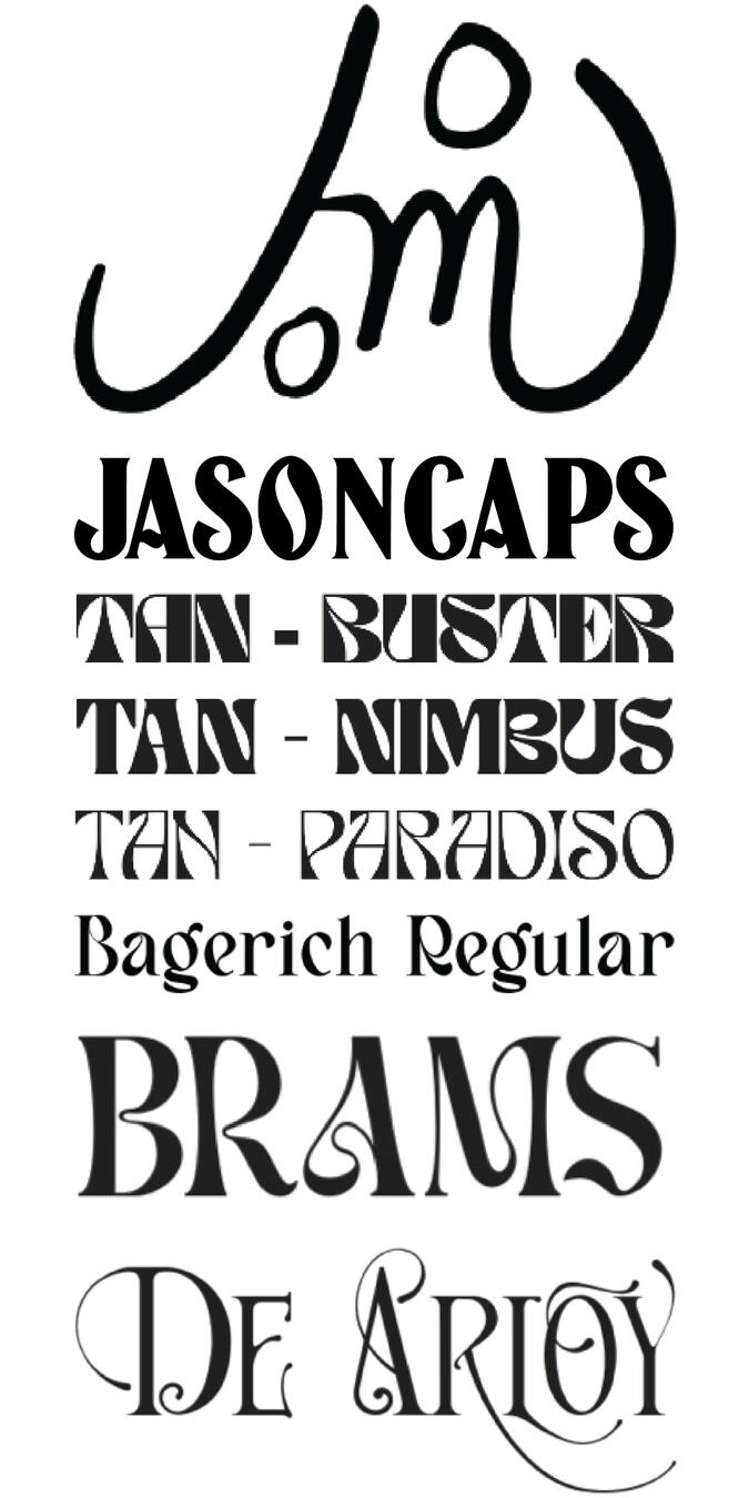
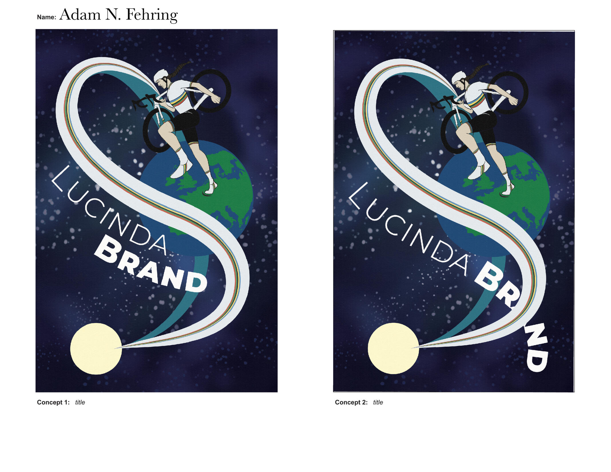
Queering the Tarot: Redesigning a Book CoverOverview: Students were tasked with redesigning the dust jacket of a book that was not a part of a larger series or franchise, but could instead stand on its own.Brief: Redesign an already-existing book cover in a manner that does not copy the original design, but still gives insight into the book's themes and story.Solution: Dark, cool blues provide contrast to the warmer skintones of figures alluding to The Fool and The World cards respectively being on the front and back. The rainbow infinity wraparound aludes to the infinite cycle of the Fool's Journey while also encompassing the rainbow flag designed by Gilbert Baker. Elements of the title typeface (JasonCaps) are pulled in addition to elements of the star pattern to create embellishments on the flaps.
Concept Sketches
Rough Sketches
Tight Sketches
Final

Capturing a Personality in a Symbol
Brief
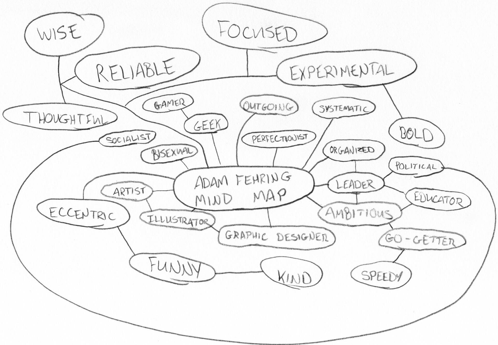
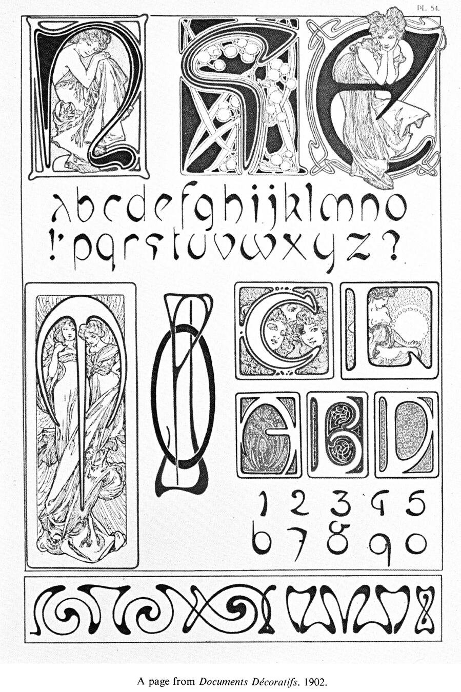
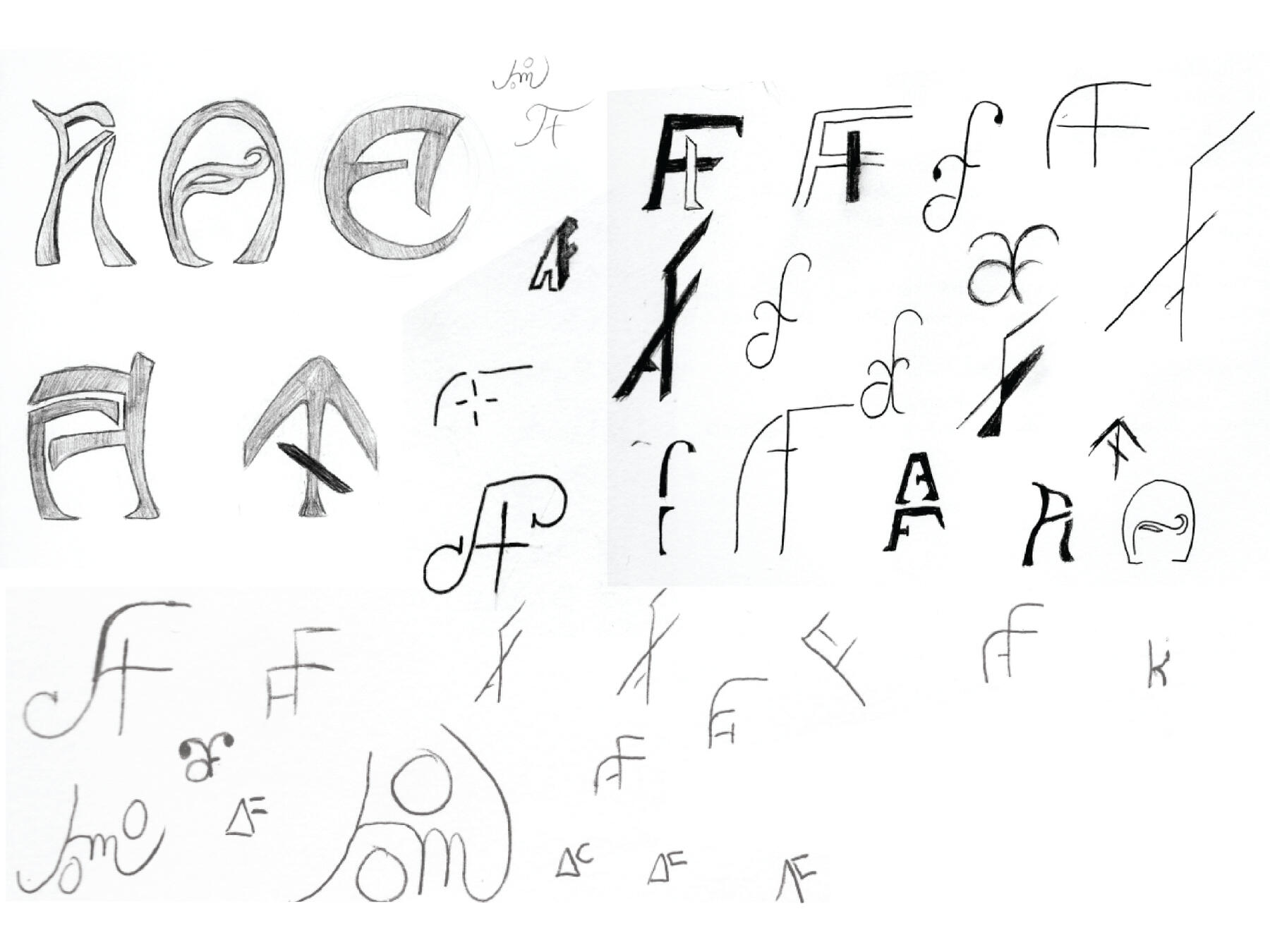
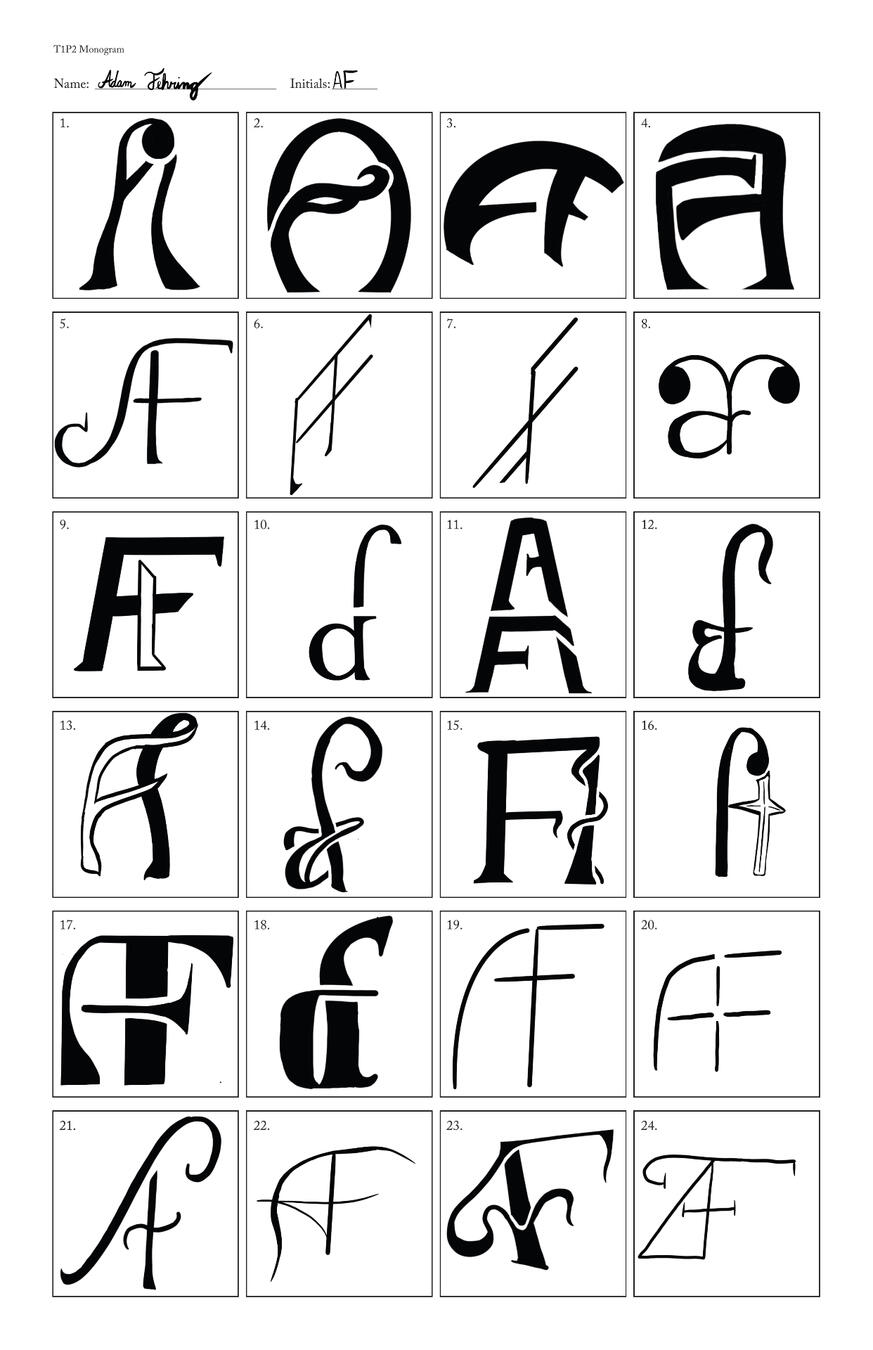
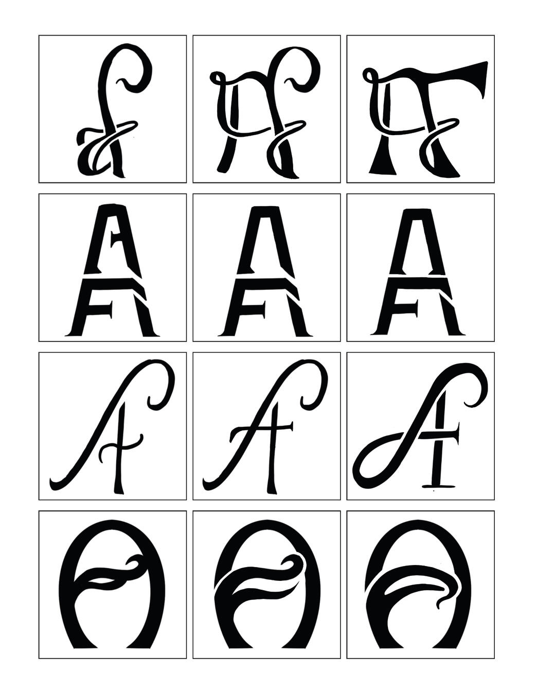
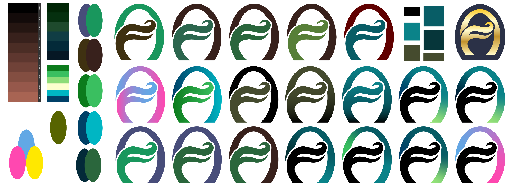
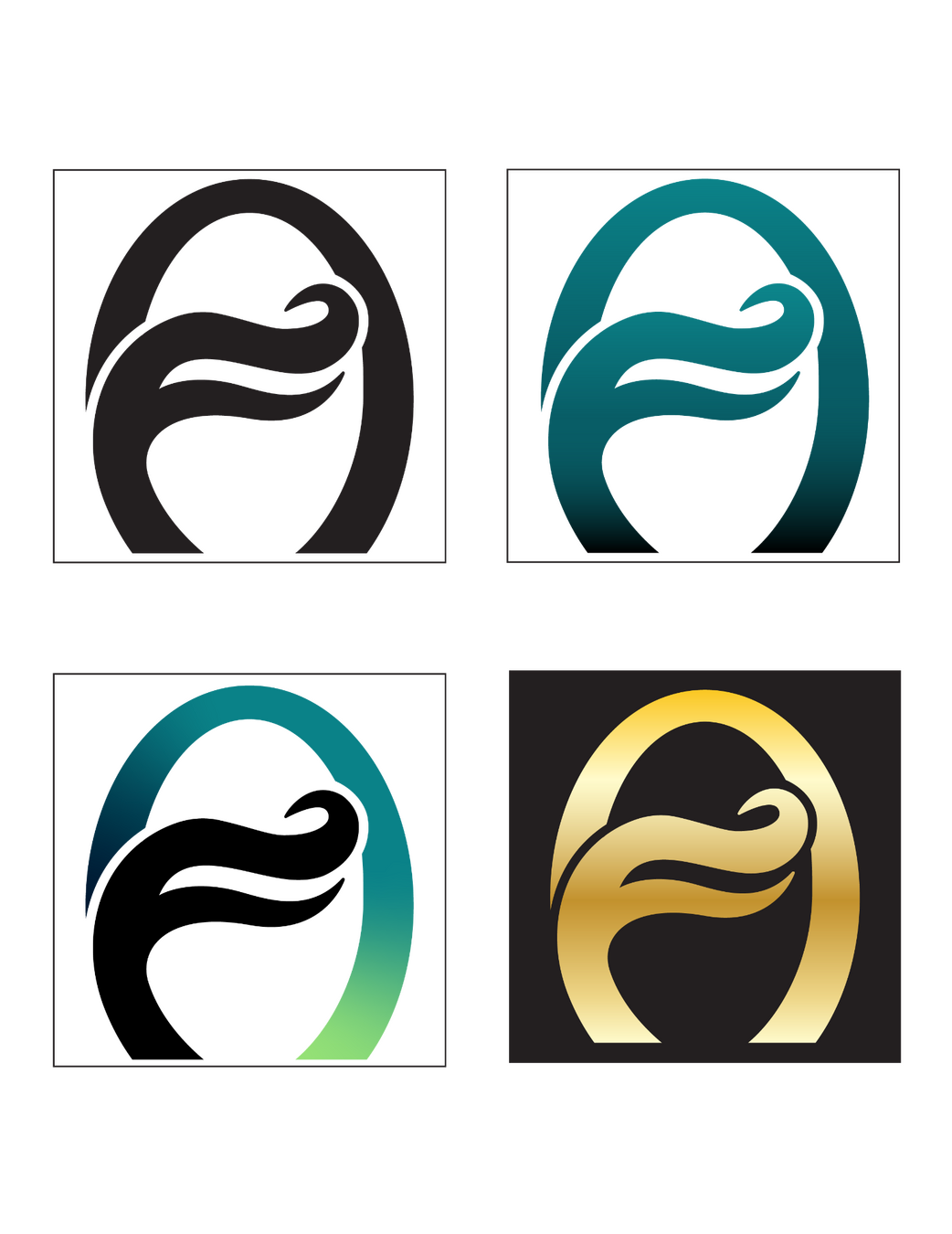
Personal Monogram: Capturing a Personality in a SymbolOverview: Students were tasked with designing a logomark for their personal "Brand Identities."Brief: Design a monogram combining your initials to create a lettermark and form a personal brand identity. Use elements of your personality and identity to inform type treatment and learn how "key words" can impact the feel of a brand mark.Solution: Bold, Reliable, Wise, and Systematic were the words focused on after polling a few peers on Fehring's personality. The final solution was inspired by letterforms designed during the Art Nouveau movement and captured Fehring's keywords in a reliable arched "A" which protected an organic "F."
Initial Research
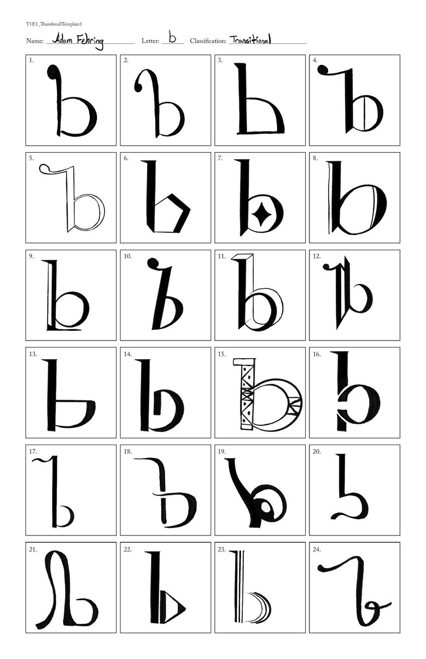
Sketchbook Thumbnails
Finalized vector
Color process
Finalized monogram

Celebration of Women Cycling • Lucinda Brand
Brief
TREK: Modern IconsOverview: Students were tasked with designing a logomark for their personal "Brand Identities."Brief: Design a monogram combining your initials to create a lettermark and form a personal brand identity. Use elements of your personality and identity to inform type treatment and learn how "key words" can impact the feel of a brand mark.Solution: Bold, Reliable, Wise, and Systematic were the words focused on after polling a few peers on Fehring's personality. The final solution was inspired by letterforms designed during the Art Nouveau movement and captured Fehring's keywords in a reliable arched "A" which protected an organic "F."
Final
Concept Sketches
Tight Sketches

A Series of Spot Illustrations
Concept Sketches
Tight Sketches
Final Sketch
Graphic Tee Mock-up

Natural Textural All-over Prints
Research
Initial Marks
Digitized Marks
Digitized Stripe Layout
Final Colorways
Mock-ups

All-over Type
Mock-ups
Graphic Tee Mock-up
Monopoly redesign
Brief
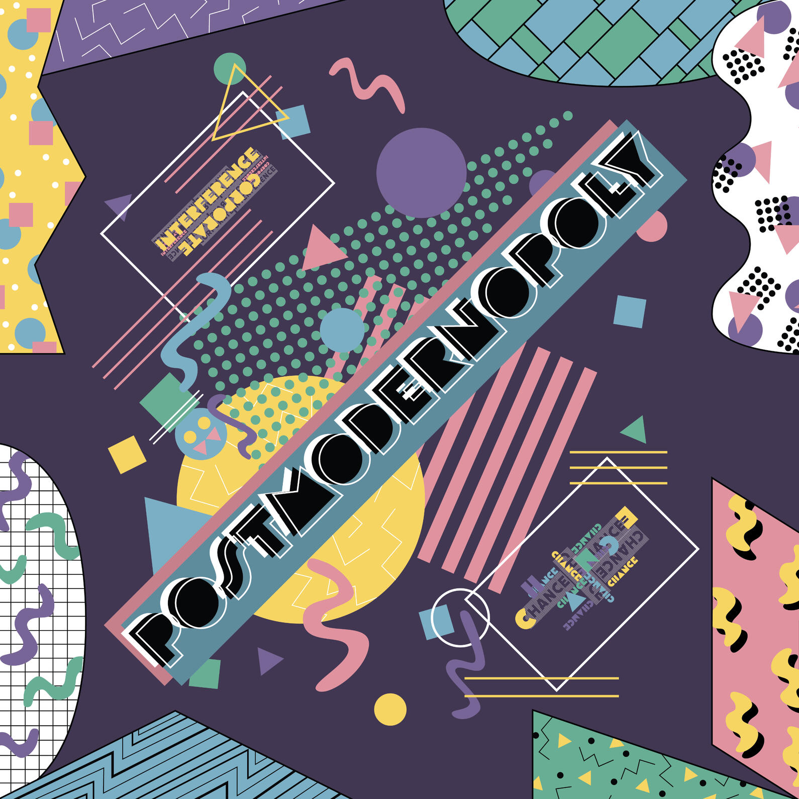
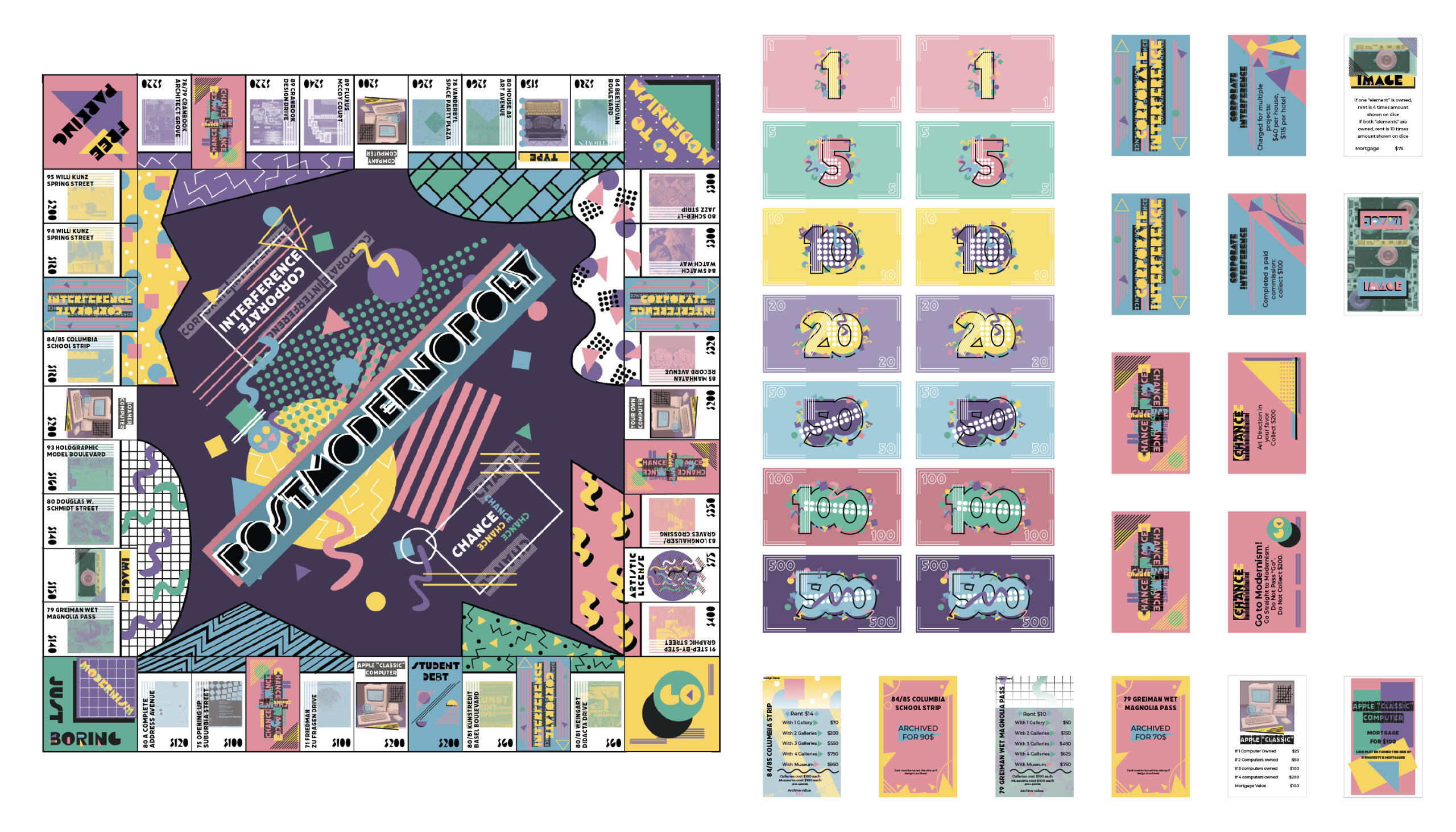
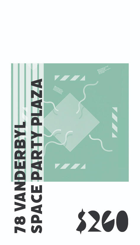
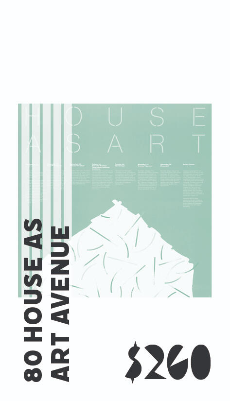
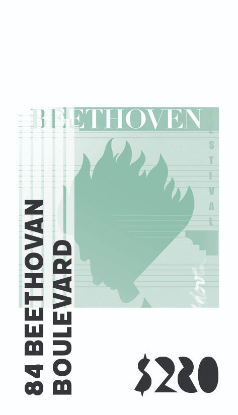
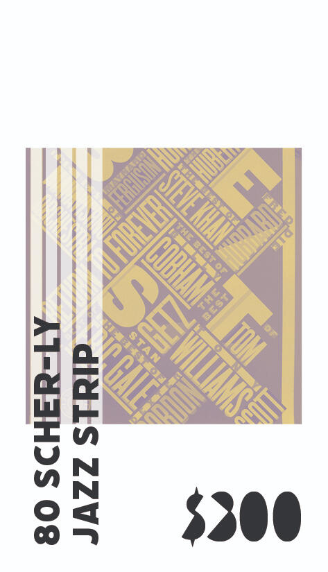
Monopoly: Postmodern DesignOverview: There are hundreds of themed Monopoly boards in the world. Students were tasked with working in a team to design one such board based on a specific design movement—in this case, Postmodern Design.Brief: Alongside three other designers (Micah Pfeiffer, Sarah Winzenried, and Preston Parise), create a Monopoly board themed around Postmodern Design. Fully design the board center, property spaces and cards, corner spaces, chance and community chest spaces and cards, money, and all other game assets together as a team. Delegate responsibilities among one another.Solution: By focusing on the Postmodern ideals of the Memphis Group, an abstract geometric approach was landed upon. In particular, I was tasked with designing the property spaces which are all cohesively reference a different piece of postmodern design from one of eight designers. On top of that, I took it upon myself to organize the final board, the final presentation images, and go over each piece created by my group members to ensure every element was consistent.
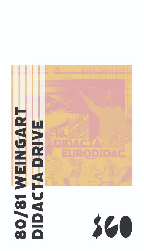
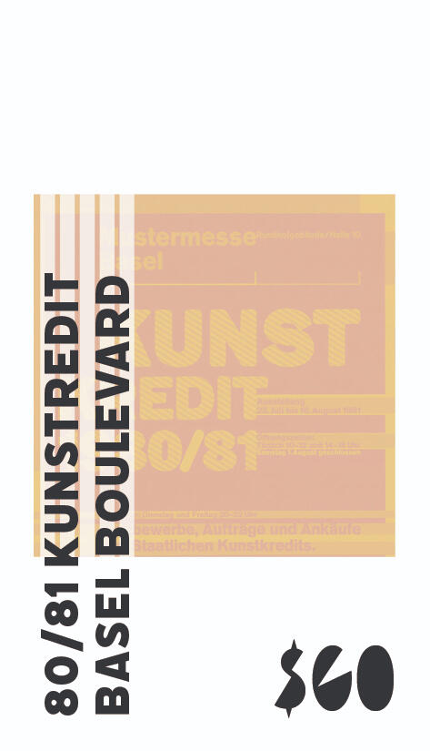
Property Spaces
HUDL Brand concept
Brief
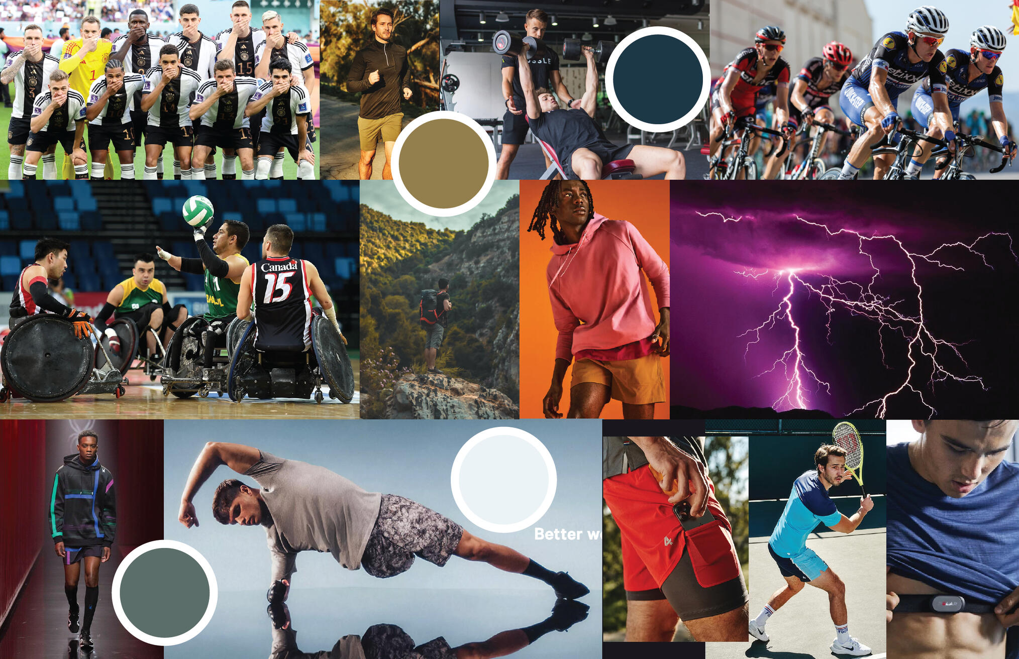
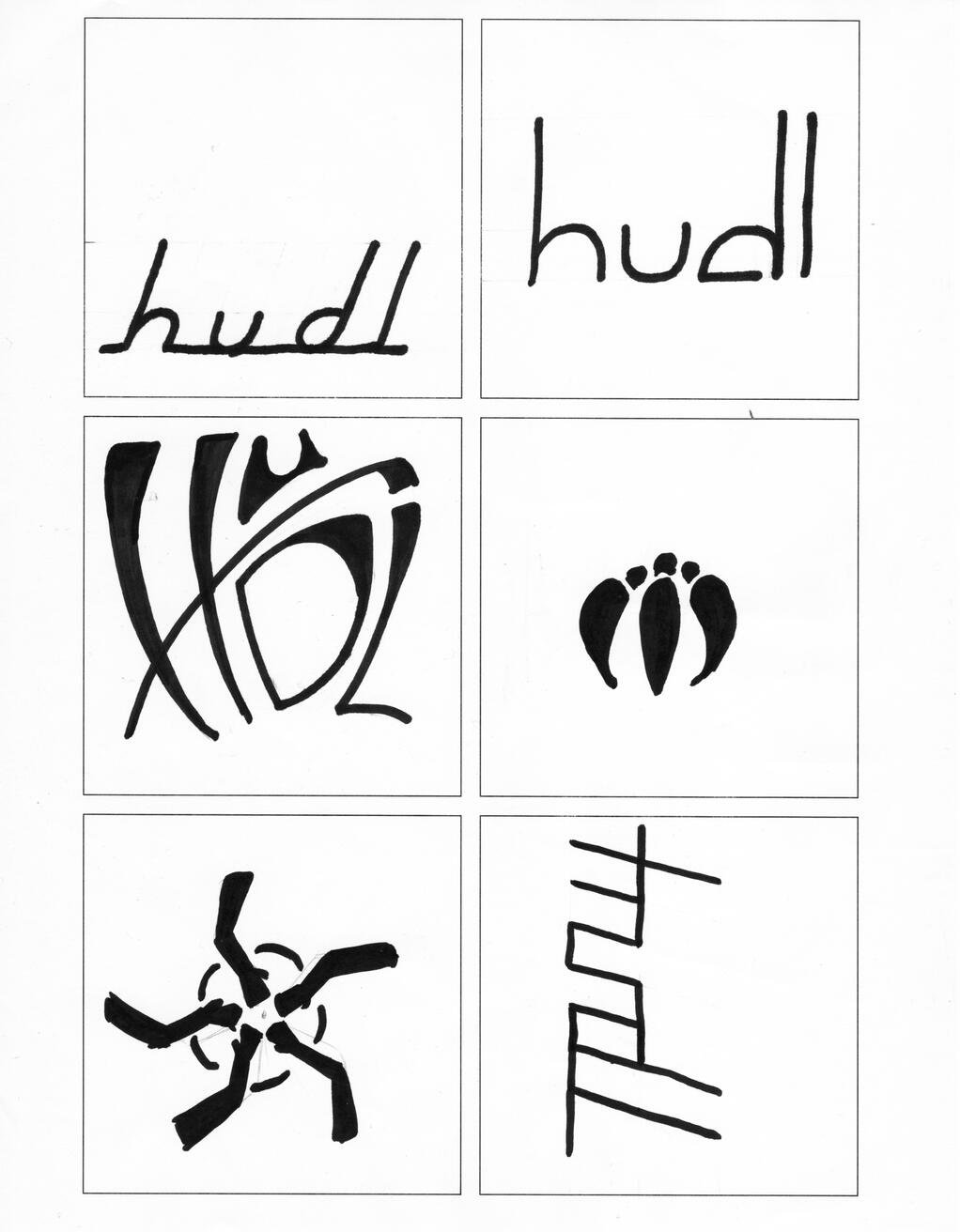
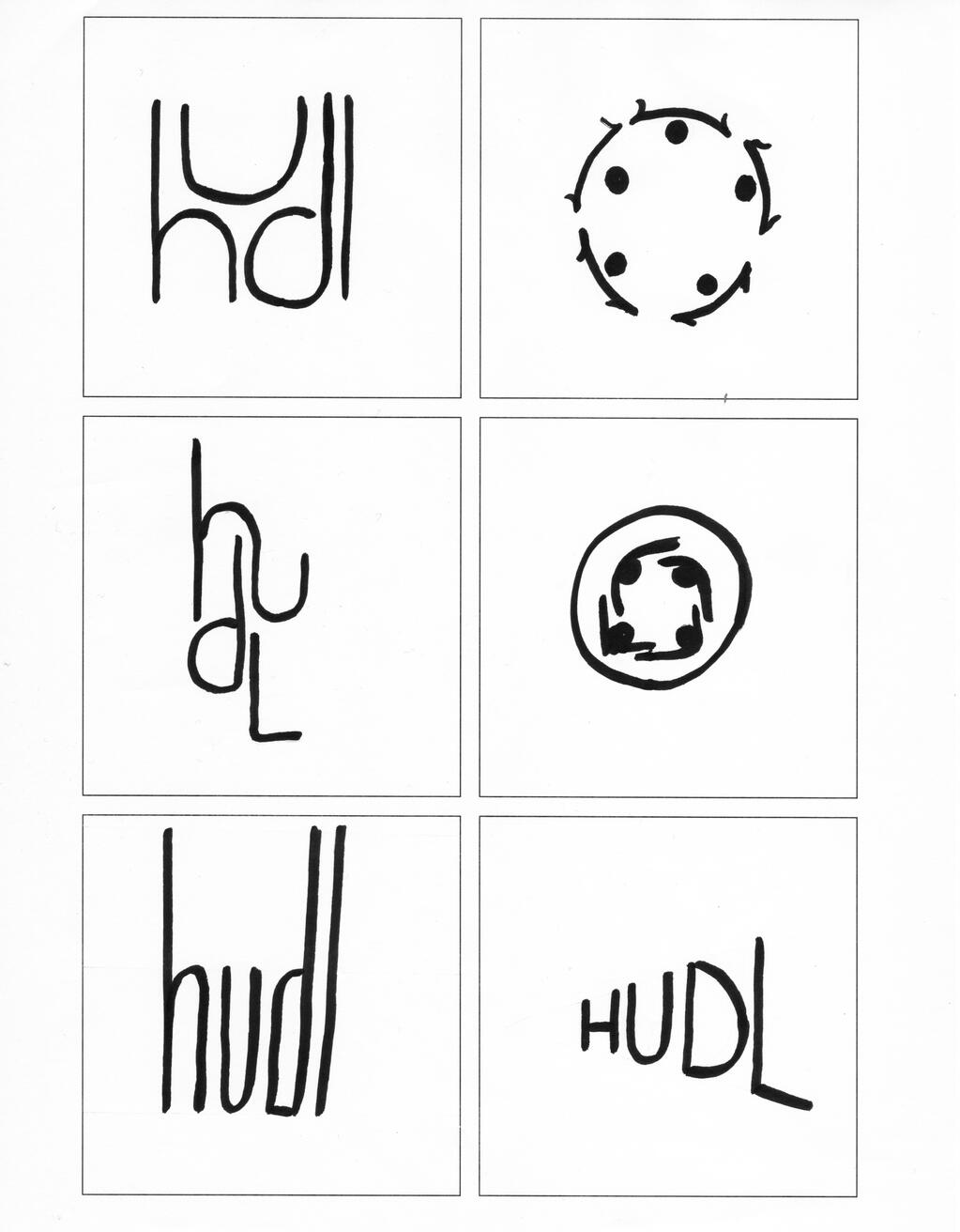
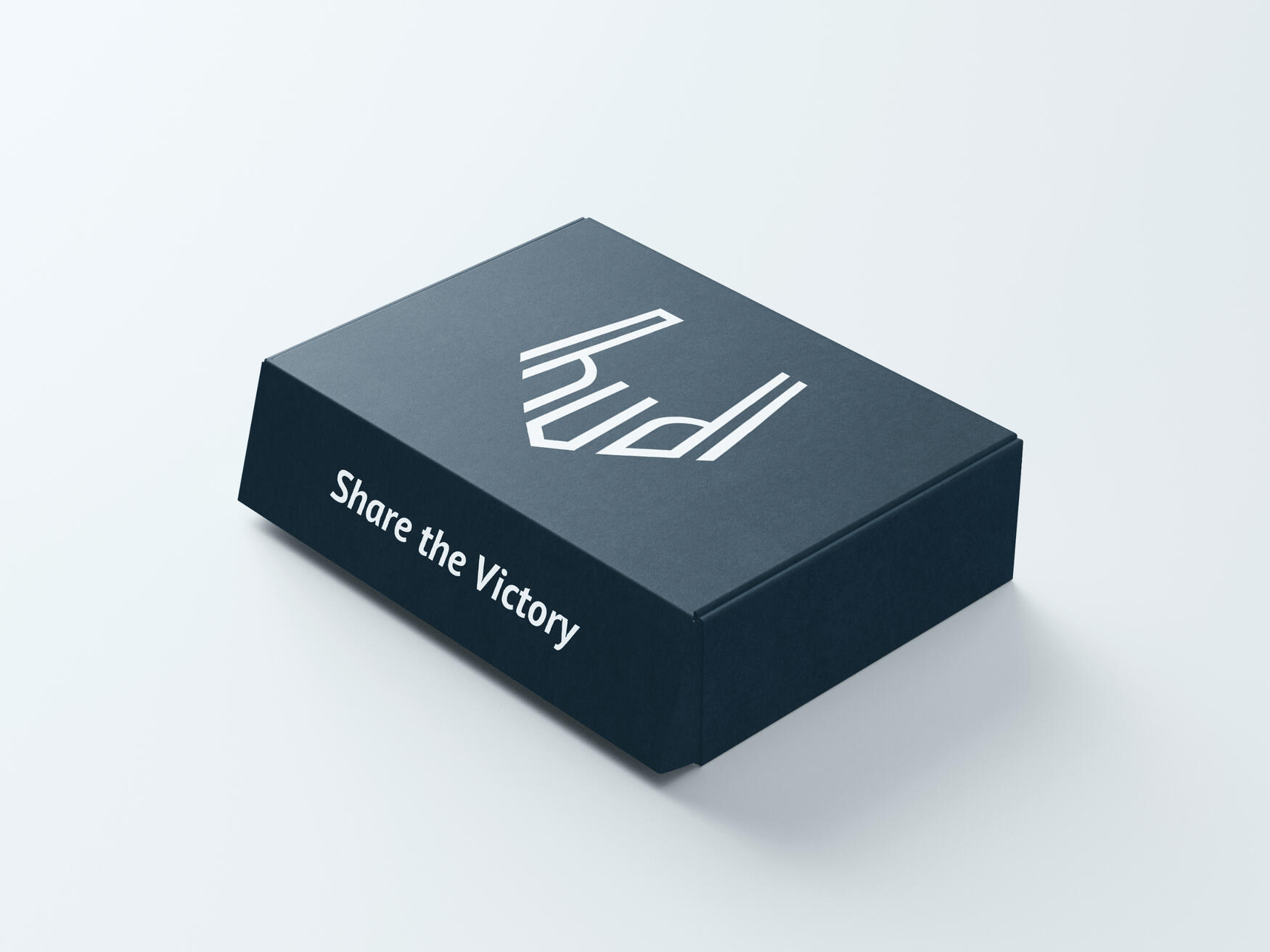
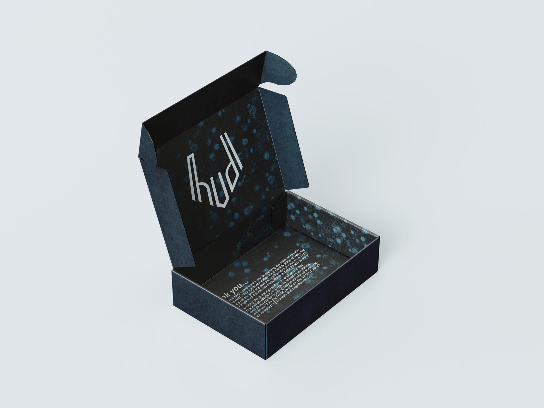
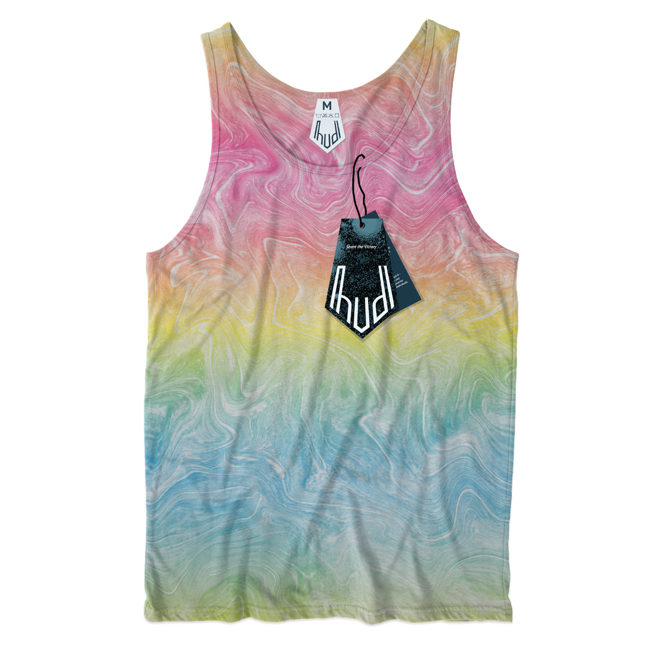
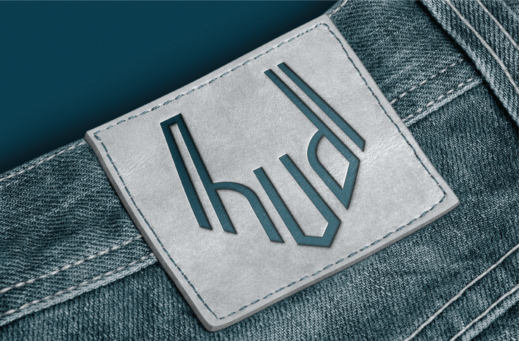
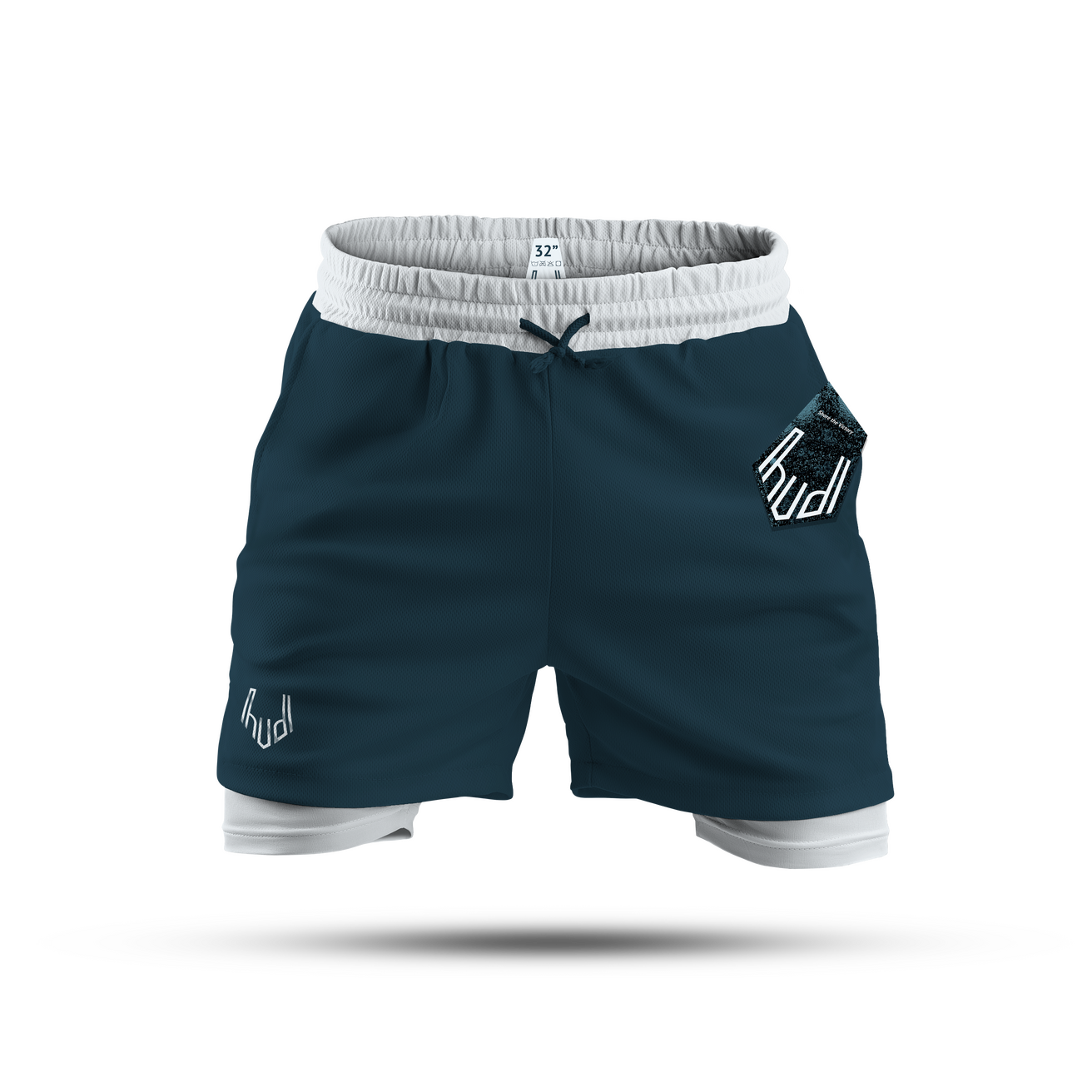
HUDL: Clothing PackagingOverview: HUDL is a fictional athletic wear clothing brand created to practice identity design within packaging elements. Its brand caters to men aged 25-30, providing a wide range of activewear and athleisure options suitable for individuals of all fitness levels. HUDL's products, crafted from eco-friendly materials and designed with inclusivity in mind, demonstrate their dedication to fostering a team-oriented fitness journey.Brief: Students were tasked with identifying a white space within the fashion market, creating, and developing brand standards: including designing logomarks, identifying color palettes, type choices, developing a brand voice, copy direction, and branded packaging elements.Solution: In identifying the "team-oriented" white space within the athleticwear industry, Fehring focused on creating a brand centered on that "huddle" idea. The identity marks and packing center around the wordmark huddling with eachother. The sharper edges and rougher texture of the packaging elements allude to the target demographic.
Moodboard
Brand Concepts
Final Logomark
Final Packaging Elements
Main Squeeze Brand concept
Brief
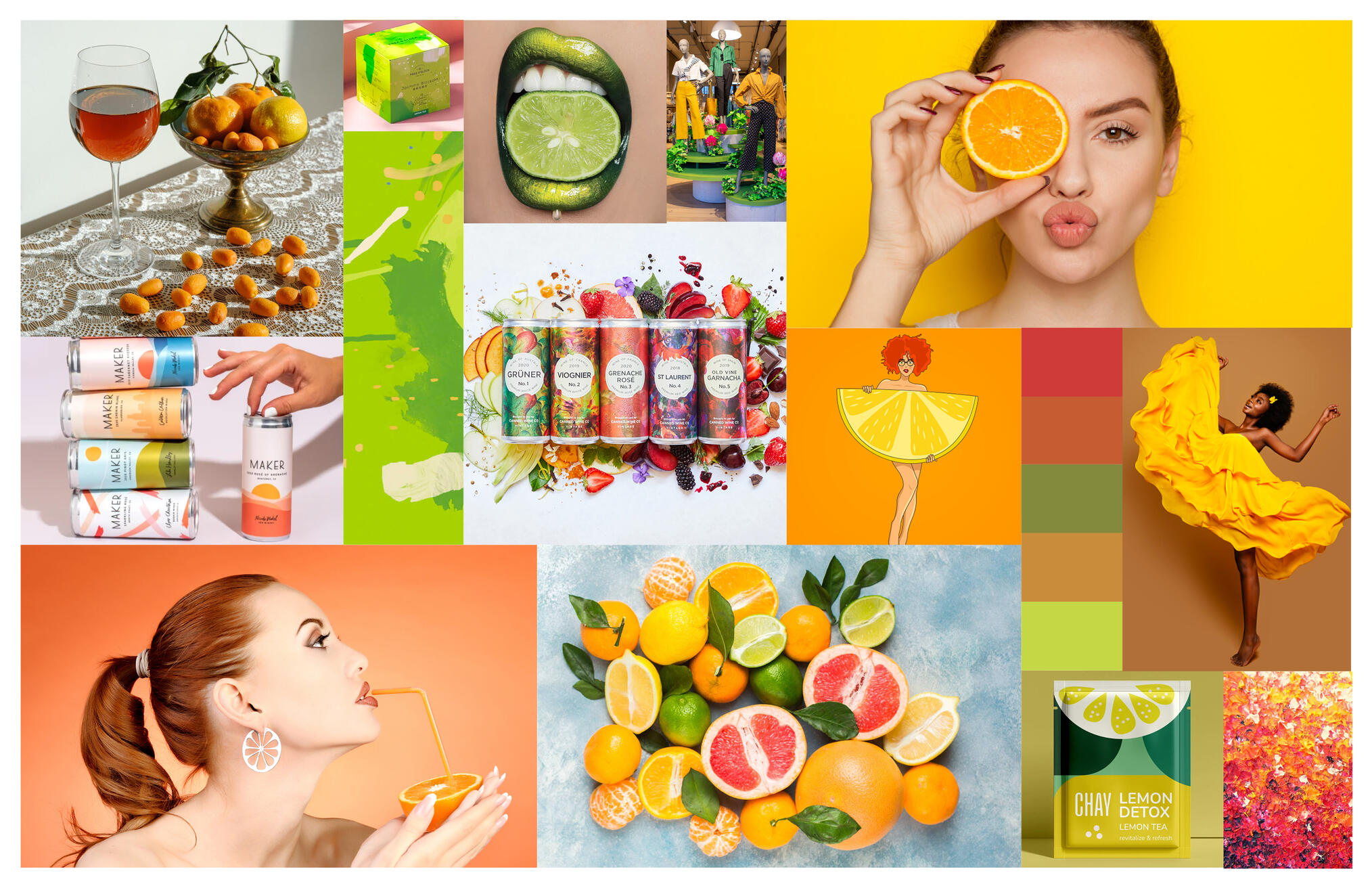
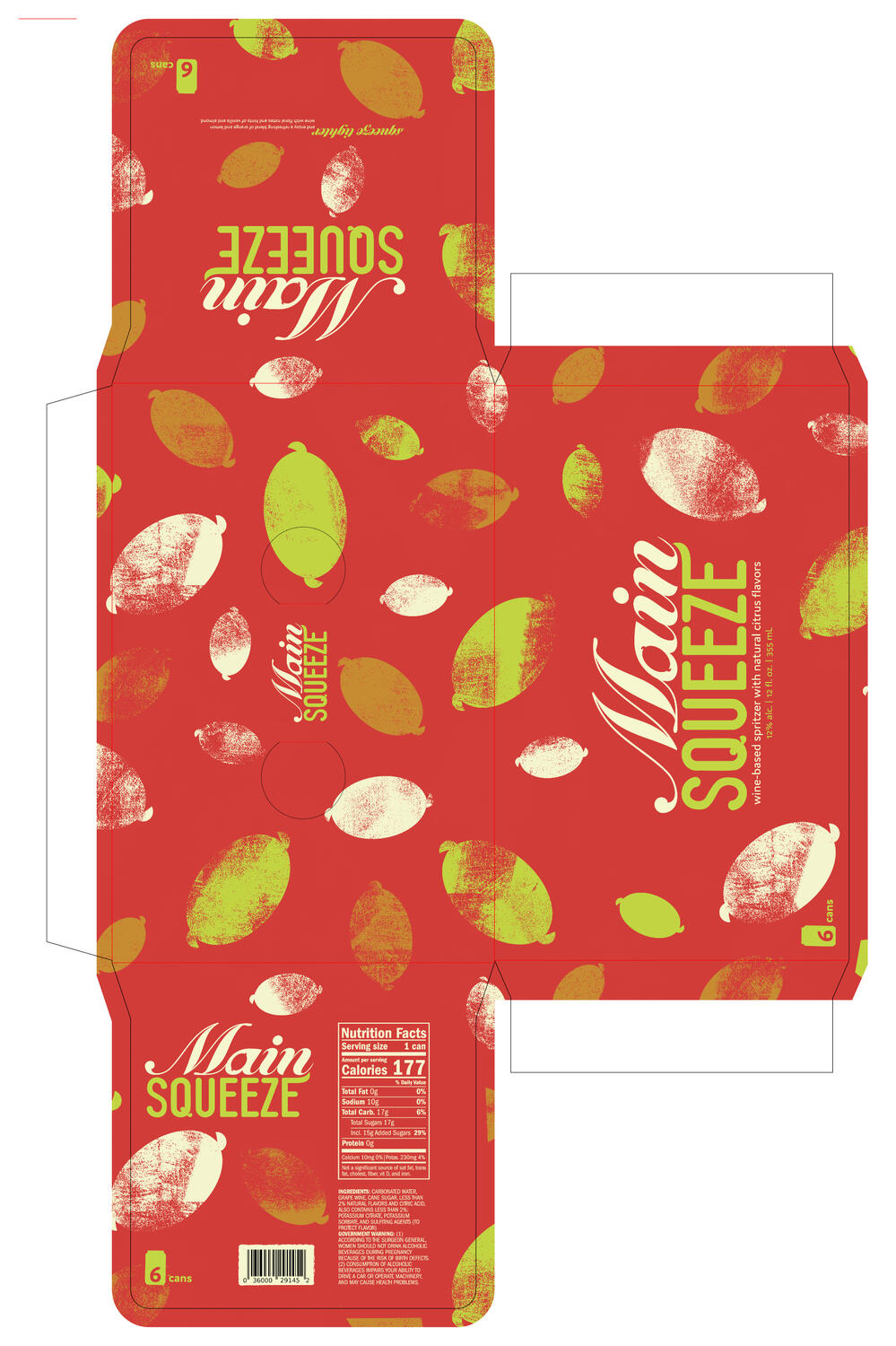
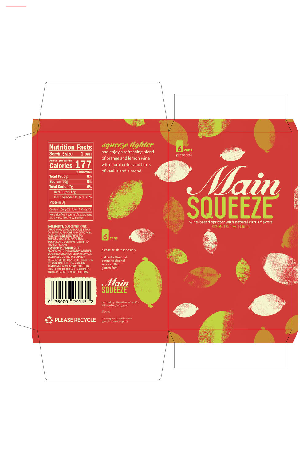
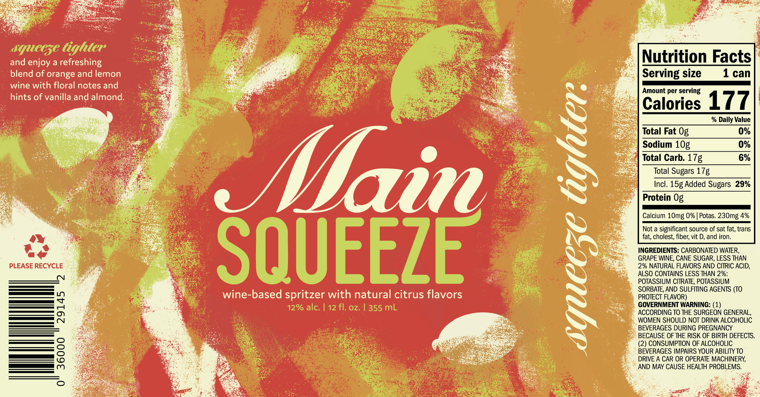
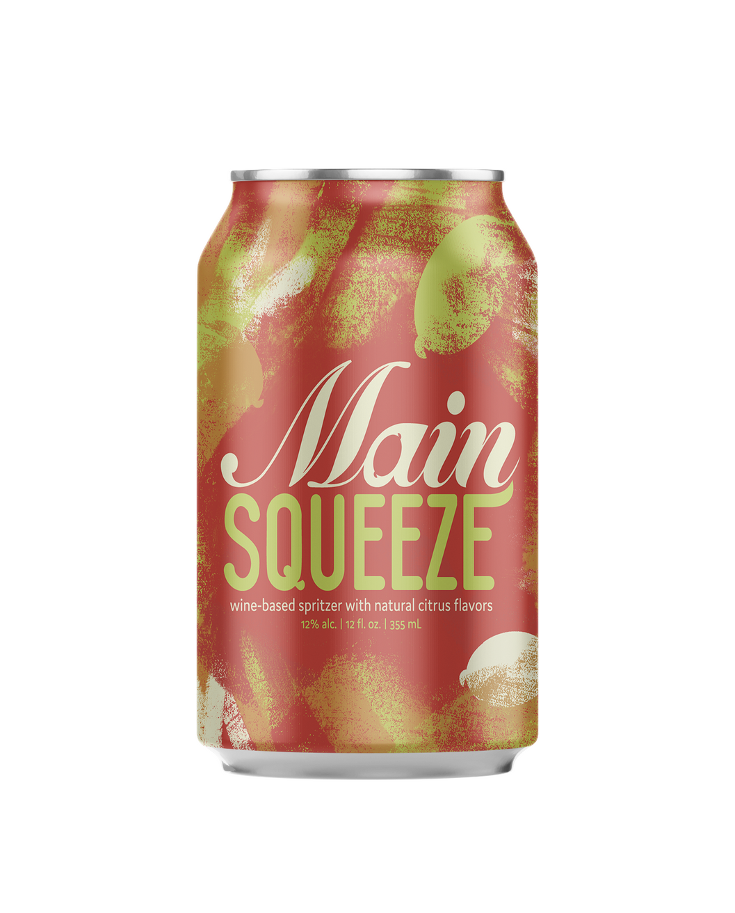
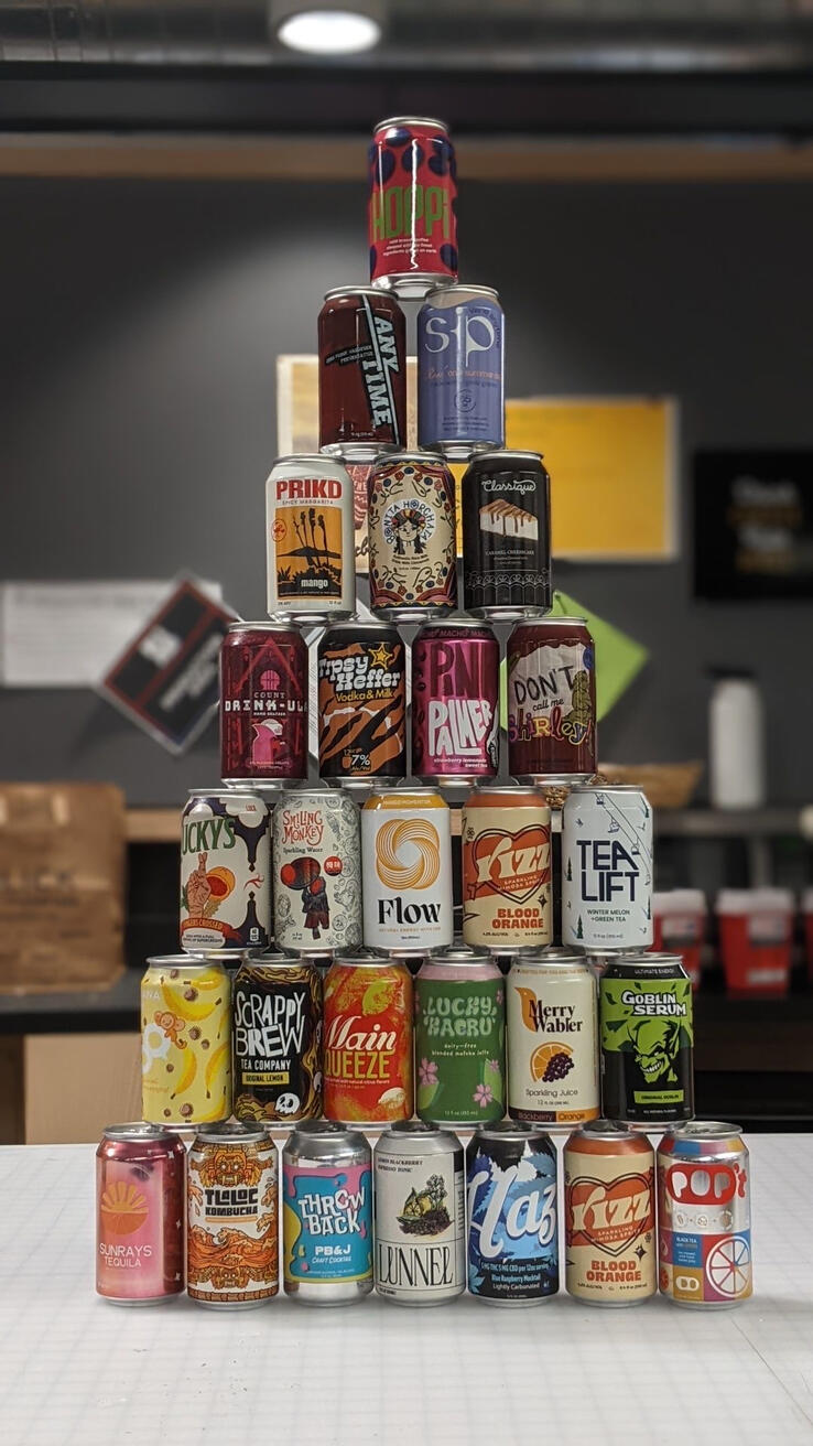
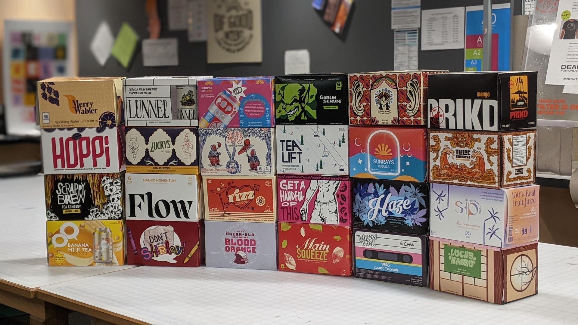
Main Squeeze: Beverage PackagingOverview: Main Squeeze, a fictional wine brand, introduces a refreshing twist in the beverage market with its sweet wine-based spritzer, enriched with natural citrus flavors. Targeting upper-middle-class women aged 25-35, Main Squeeze is designed for the trend-savvy and liberal consumer who enjoys exploring new and exciting flavor profiles. Positioned in competitive retail environments like Total Wine & More, it offers a playful alternative to conventional wine choices while remaining canned for easy distribution.Brief: Students were tasked to create beverage packaging that captivates the a fictional brand's target audience; in this case: stylish, upper-middle-class women who value quality and novelty. The designer should include a unique logomark, can design, and carrier box dieline. Embracing key attributes of the brand, Main Squeeze's packaging had to utilize a flirty voice and embody the tagline "squeeze tighter". The goal is to craft an eye-catching design that positions Main Squeeze as the go-to choice for a spirited and sophisticated drink experience.Solution: When developing the brand concept, Fehring prioritized the following keywords: Bold, Fresh, Impulsive, and Striking. The brand's identity mark is designed with a touch of sophistication, incorporating a hidden lemon in the counterform of the letter "a". This clever design ensures legibility on store shelves. To differentiate from competitors' use of watercolor, acrylic paint strokes were used to create a visually striking can design with a seamless finish. The box design, in contrast to the can, takes a simpler approach, while highlighting the brand's signature red color to draw attention to the painted lemons.
Moodboard
Final Logomark
Final Dielines and Can Design
Physical Products
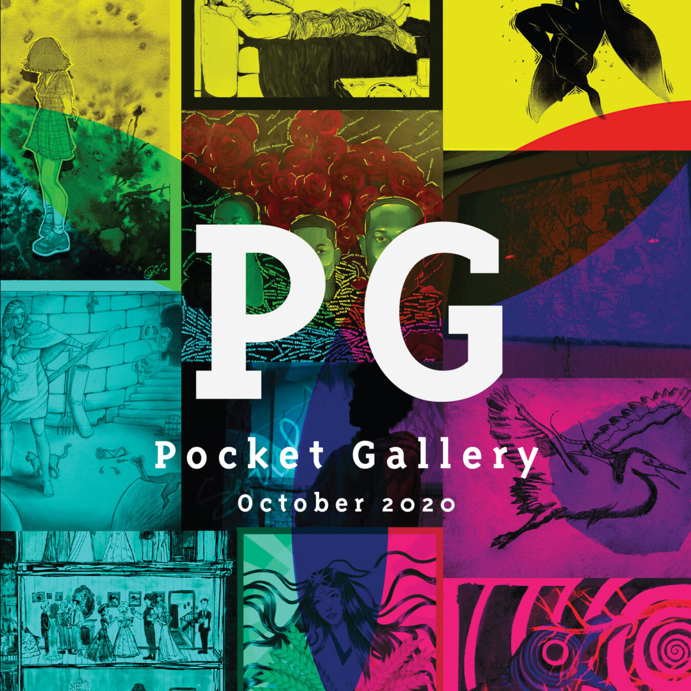
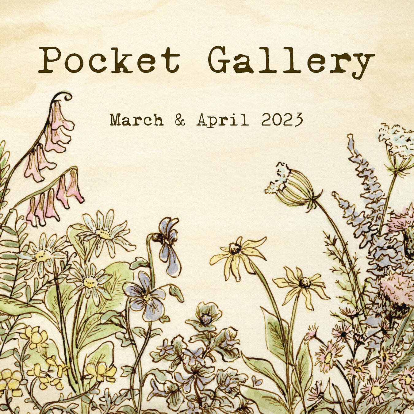
Pocket Gallery: Student Organization
Overview
MIAD's Pocket Gallery was a student organization founded in 2020 by Adam Fehring and fellow designers: Sophia Briej, AJ Isacson, Diego Loyo, and Ty Kingrose. Fehring served as the president of the club from March 2020 through January 2022 and maintained an active role in it's development throughout his undergrad.Pocket Gallery remains a student-run bimonthly booklet production club at MIAD. It accepts artwork from students, staff, faculty, and alumni to create a rotating gallery each semester. Submissions can include traditional art, textiles, 3D pieces, photography, and written work. Booklets are posted on the club's website and donated to the MIAD library. Periodically, physical booklets are sold alongside merchandise like keychains and stickers.
Obsidian Brand Concept
Brief
Obsidian: Personal Hygiene PackagingOverview: Obsidian is a fictional luxury men's grooming brand for upper-class men aged 30-50. It offers a range of high-end products including cologne, beard balm, oil, deodorant, and aftershave; chosen to practice a wide variety of packaging that can exist within a larger brand identity.Brief: Students were tasked with creating packaging designs for fictional brand, in this case, a luxury men's grooming brand called Obsidian. The objective is to create a cohesive brand identity across five product types, reflecting the brand's core values and maintaining a design approach which considers functionality and the aesthetics of the target demographic. This exploration demonstrates how a unified visual language can be applied to different products while maintaining the brand's core values.Solution: When developing the brand concept, Fehring decided to tap into a more upperscale demographic, settling on a single word that conveyed a certain sense of luxury, Obsidian. The brand's identity mark went through a few variations prior to settling on the Traditional Serif wordmark in a gold gradient, intended to be an actual metallic on store shelves. To differentiate from competitors' use of monochromatic neutrals, a purple marble texture was utilized as a ground color; offering a nice contrast to the gold lettering. Metallic gold accents were utilized as an accent throughout the product line to add a touch of sophistication.
Brand Presentation
Nifty Nibble Brand Package
Brief
Nifty Nibble: Brand Identity PackageOverview: Nifty Nibble is a student-run restaurant in West Bend High Schools; it specializes in offering a real-world culinary experience for teenagers. Catering to health-conscious 13-16-year-olds, it integrates current food trends and technology to prepare students for the food service industry. The restaurant's unique approach emphasizes homestyle cooking with a twist, providing nutritious, farm-to-table meals as an alternative to standard school lunches.Brief: This project focuses on developing a comprehensive brand package for Nifty Nibble, including a cohesive brand mark, business card, letterhead, website homepage, and two physical items - a coffee cup and a chef's coat. The branding needs to resonate with the restaurant's mission and appeal to its target audience of health-conscious teenagers. The brand identity should encapsulate the keywords: Friendly, Fresh, Homestyle, and Classic, reflecting the establishment's innovative yet familiar approach to student culinary education.Solution: In reimagining the Nifty Nibble's brand identity, Fehring's fresh approach successfully modernized the retro diner aesthetic to resonate with the 2020s. The selection of a lower-case sans serif type, reminiscent of a chef's knife, not only symbolizes the essential knife skills taught at the restaurant but also infuses a contemporary feel. The playful 'nibble' serrated edge on the larger knife adds character and directly ties to the brand name.The creation of a sandwich repeat pattern serves as a versatile accent, enhancing the website's visual appeal and adding a unique touch to packaging items like the coffee cup. This motif, along with the bite mark on the business card, injects a sense of fun and aligns with the youthful energy of the brand. The letterhead's subtle knife motif, set against the brand's faded mustard color, provides a professional yet inviting look. Finally, the stylish chef's coat not only serves as a practical uniform for the staff but also reinforces the brand's identity, offering personalization through the option for embroidered names.
Brand Presentation


